AI assistant design principles for product teams
AI assistant design comes down to four principles: scope, transparency, recoverability, and consent. A field guide for B2B SaaS product teams.
 Sohanur RahmanAI Copilots & Assistants7 min read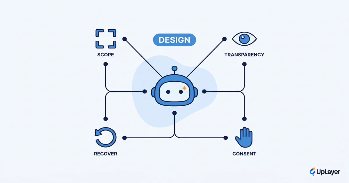
Most teams design the part of an assistant that demos well. The clean chat bubble, the streaming text, the suggestion chips. Then they ship, the assistant gets something confidently wrong in front of a paying customer, and there is no obvious way to catch it, fix it, or get back to manual control. The failure path was an afterthought, because the whole thing was built for the happy path.
Good AI assistant design is mostly the opposite of that. It is the discipline of deciding what the assistant should refuse to do, how it shows what it is unsure about, and how a user recovers in two seconds when it is wrong. The chrome matters least. We treat it as four principles: scope, transparency, recoverability, and consent. This piece walks each one, gives you a refusal list most guides skip, and ties the work back to a metric you already track. If you are building the broader trust story, start with our guide to designing AI assistants for B2B SaaS; this is the principles layer underneath it.
What principles guide AI assistant design
The short answer: four principles hold up after the model changes, the chat library changes, and the trend cycle moves on. Scope (what it does), transparency (what it admits), recoverability (how you undo it), and consent (what it is allowed to touch). Patterns expire. Principles do not.
It helps to understand why an assistant needs its own design discipline at all. An assistant flips the interaction model. Instead of clicking through a known path, the user states an outcome and the system decides how to reach it, which Nielsen Norman Group calls intent-based outcome specification. That reversal is powerful and fragile at the same time: the user gives up control of the steps, so your job is to design the controls that give it back. The four principles are how you do that.
| Principle | The design question it forces | The failure it prevents |
|---|---|---|
| Scope | What is this assistant allowed to do, and what does it refuse? | An "everything box" that is mediocre at all of it |
| Transparency | How does the user know what it can do and how sure it is? | Confident wrong answers taken as fact |
| Recoverability | How does the user catch and undo a bad result in seconds? | Lost work, abandoned feature, churn |
| Consent | What can it touch without asking, and what needs a yes first? | Irreversible action no one approved |
Work the table top to bottom before you open Figma. Every good design decision downstream is a consequence of one of these four.
Scope: a supportive AI, not an everything box
Decide the narrowest version of the assistant that is still worth building, then build that. The strongest assistants do one job inside the product extremely well. The weakest ones are a chat window bolted to the corner that promises to do anything and commits to nothing.
We design assistants as a supportive AI: a layer on top of the core engine, not a replacement for it. The product still works if the assistant is off. The assistant earns its place by making one existing job faster or fewer steps, and it is measured against the metric that job already has. That framing keeps scope honest, because a feature with no metric has no reason to exist. Anthropic makes the same case from the engineering side: the most successful implementations use the simplest pattern that works, and you only add autonomy when a simpler design genuinely falls short.
Scope is also a cost decision. Every capability you add is a surface that can fail, a path you have to design recovery for, and inference you pay for on every call. Designing AI assistants well means ranking candidate capabilities by projected ROI and cutting the ones that will not pay off, before they become features you have to support.
WARNING
The most expensive AI assistant design mistake is building for the happy path. Failure is not an edge case in an assistant. It is a frequent, guaranteed state. If you have not designed the wrong-answer screen, you have not designed the feature.
Transparency and the assistant's UX of uncertainty
The assistant should make its limits visible before it makes a mistake. Tell the user what it can do, how well it can do it, and how sure it is about this particular answer. Microsoft's HAX guidelines put this first for a reason: make clear what the system can do and how well it can do it, and design distinct behavior for the moments it is wrong.
This is the heart of good AI assistant UX, because the default failure mode is invisible. An assistant presents a wrong answer in the exact same confident tone as a right one. Nielsen Norman Group's research on hallucinations is blunt about the cost: when a system is confidently wrong and the interface gives no signal, users either catch it the hard way or trust it and ship the error. Either way you lose them.
Transparency is not a disclaimer in the footer. It is showing sources, flagging low confidence inline, and never dressing a guess up as a fact.
Practical transparency looks like: citing where an answer came from, surfacing a confidence signal when the model is unsure, and making the AI nature of the output obvious rather than hiding it behind a human-sounding tone. Once the principles are set, the surface-level choices follow. Our AI assistant UX patterns guide covers the component-level decisions that express this transparency on screen.
Recoverability and reliability guardrails
Assume the answer will sometimes be wrong, then design the screen so the user catches it, fixes it, and keeps their work. Recovery is a first-class surface, not an error state you bolt on at the end. The qualities that separate trusted assistants from abandoned ones are unglamorous: undo, inline edit, an honest error message, and a clear escape hatch back to manual control.
The reliability guardrails that matter most scale with how reversible an action is. A cheap, reversible action can run on its own. A destructive, hard-to-undo action needs a human yes first. Anthropic frames this as building in checkpoints and stopping conditions so the system pauses for human judgement instead of running unbounded, and Google's PAIR guidebook treats this as giving users the right level of control and a real way to correct the system. A simple way to make those calls consistent is to sort every assistant action into risk tiers.
# action-risk tiers: design recovery before you design the action
tiers:
  - tier: auto          # cheap, reversible, low blast radius
    examples: ["draft a summary", "suggest a reply", "filter a list"]
    guardrail: "run silently, always offer Undo"
  - tier: confirm       # changes shared or persistent state
    examples: ["edit a record", "send a message", "apply changes"]
    guardrail: "preview the change, require explicit Keep / Discard"
  - tier: refuse        # irreversible or out of scope
    examples: ["delete data", "charge a card", "act beyond granted scope"]
    guardrail: "do not act; hand back to a human with context"
The mechanics worth copying come from products that ship this well. An edit flow that gives every AI change an explicit keep-or-undo. A workspace snapshot before each run so a bad session can be rewound. An assistant that pauses and asks before it touches anything risky. The shared rule: the more severe and less reversible the action, the more human confirmation it earns. For the deeper version of this, see our guide to reliability guardrails that keep a copilot in bounds.
What should an AI assistant never do
The refusal list is the consent principle made concrete, and it is the part most design guides skip. A short list of hard nos does more for trust than any amount of polish. An assistant should never:
- Take an irreversible or high-impact action (delete, send, pay, share) without an explicit human yes.
- Hide that it is AI, or use a human voice to imply a confidence it does not have.
- Present a guess, an assumption, or a fabricated source as a verified fact.
- Block or hide the manual path. The user can always do it themselves.
- Act outside the scope it was granted, even when it technically can.
Write your own version of this list before you write a single prompt. It is the cheapest reliability work you will ever do, and it is the difference between a supportive AI and a liability sitting inside your product.
How do you design an assistant that fails gracefully
Graceful failure means the user notices the mistake, corrects it in seconds, and never loses the work they had. That is the test. If a wrong answer costs the user thirty seconds, they stay. If it costs them their progress or slips through unnoticed, they leave and they tell people why.
Pull the four principles together and the path is clear. Scope keeps the assistant small enough that failure has a small blast radius. Transparency means the user can see the failure coming. Recoverability gives them a two-second exit. Consent means the worst failures never run without a human in the loop. None of this is visible in a demo, which is exactly why most teams skip it and most assistants flop.
Anchor the whole effort to a number. Pick one job the assistant supports, find the metric that job already has, and design the failure path before you design the feature. If you cannot name the metric, you are not ready to build, you are ready to do a roadmap theater. Measuring the result is its own discipline, covered in a metric you already track. The principle holds regardless of model: rank by projected ROI, build the narrow thing, and treat recovery as the feature.
The teams that get AI assistant design right in 2026 will not be the ones with the slickest chat UI. They will be the ones whose assistant knows its scope, shows its uncertainty, undoes its mistakes, and asks before it acts. Build for the wrong answer first, and the right ones take care of themselves.
TIP
Not sure which assistant capability is worth building, or whether it will move a metric? How the AX Audit works. We find the single highest-ROI AI feature for your product, prove it on a number you already track, and tell you what not to build.