AI assistant UX patterns that keep users in control
A working catalog of AI assistant UX patterns (suggest, confirm, undo, cite) for B2B SaaS teams who want adoption and trust, not just an abandoned widget.
 Sohanur RahmanAI Copilots & Assistants7 min read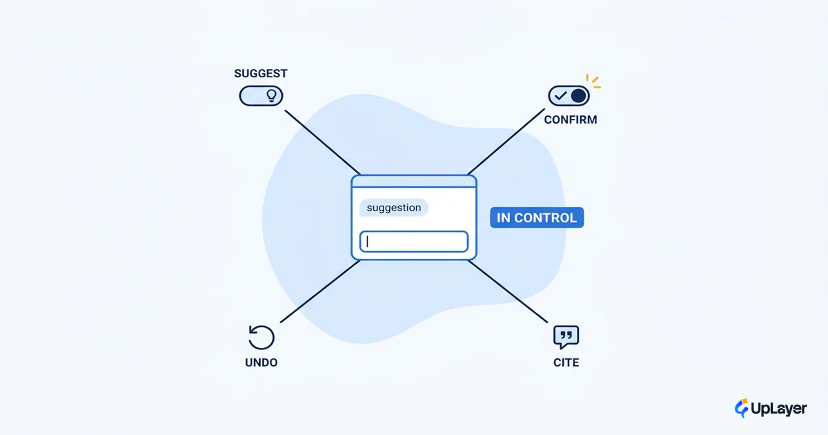
Most in-app assistants don't fail because the model is wrong. They fail because the AI assistant UX quietly took control away from the user, the user got burned once by a confident mistake, and they never opened the panel again. The model can be excellent and the feature can still be dead in a month.
So the job of the interaction design is not to make the assistant look smart. It's to keep the person in control of anything that matters, while the assistant handles the boring, reversible 80%. Get that right and people keep the assistant open, which is the only adoption number that pays. Get it wrong and you've shipped a chatbot nobody trusts.
This is a working catalog of the interaction patterns that do that job: suggest, confirm, undo, and cite. They're not new, and that's the point. They're the patterns that keep the user in charge. If you're designing the assistant itself and not just its individual screens, start with the broader playbook in designing AI assistants for B2B SaaS and treat this as the pattern layer underneath it.
What good AI assistant UX actually optimizes for
Good AI assistant UX optimizes for the user keeping control of consequential actions, not for the assistant doing the most. That single reframe decides whether the feature gets adopted or abandoned, which is why the patterns below matter more than the model.
Here's the mechanism. Generative AI shifts the interaction model. As NN/g puts it, the user now specifies an outcome while the system decides how to produce it, which reverses the locus of control compared to the command-based software people are used to. That feels magical until the assistant does something the user didn't intend and can't easily walk back. Your UX exists to hand control back at the moments that count.
The reason this matters more than model quality is that model quality is no longer the bottleneck. Capability is climbing fast, with benchmark scores jumping double digits year over year per Stanford's 2025 AI Index. The differentiator for a B2B SaaS product isn't access to a better model. It's whether the interaction design earns enough trust that users route real work through it. That trust shows up directly in retention and feature adoption, the metrics your board already watches.
NOTE
What does good AI assistant UX look like in one line: the user is never surprised by what the assistant did, and can always undo it. If a pattern can't promise that, it's the wrong pattern for a high-stakes action.
The four control-preserving patterns every in-app AI assistant needs
There are four patterns that do the heavy lifting in any in-app AI assistant. Each one does a specific trust job, and you choose between them by the consequence and reversibility of the action, not by how impressive it looks. The art of designing an in-app AI assistant your users trust is mostly knowing which pattern a given action deserves.
| Pattern | What it does | Use it when | Trust job |
|---|---|---|---|
| Suggest | AI proposes, user accepts or ignores | Action is low-stakes and reversible | Keeps the user as the decision-maker |
| Confirm | AI drafts, user approves before it commits | Action is consequential or hard to undo | Puts a human gate on the expensive 20% |
| Undo | The action runs, but is fully reversible | Action is fast, frequent, and low-cost to revert | Removes the fear of trying the AI at all |
| Cite | AI shows sources and confidence for its claims | Output informs a decision the user owns | Lets the user verify instead of trust blindly |
The decision rule is simple enough to write as config. Scale friction to consequence and reversibility, and nothing else.
function patternFor(action) {
  if (action.reversible && action.lowStakes)   return "Suggest or Undo";  // get out of the way
  if (!action.reversible || action.highStakes) return "Confirm";          // human gate
  if (action.informsADecision)                 return "Cite";             // show your work
  // default: never auto-commit something the user can't easily walk back
}
The mistake to avoid is applying one level of friction everywhere. We'll come back to that.
Suggest, don't auto-do: defaulting to proposals
The Suggest pattern is the safe default for most assistant actions: the AI proposes and the user disposes. A drafted reply, a suggested tag, a summarized thread. The work is done for the user, but the user still presses the button.
This is the core of sound AI assistant design principles: the assistant does the slow, repetitive part, and the human keeps authorship of the result. It's frictionless because the action is reversible and low-stakes, so a wrong suggestion costs the user a glance, not a cleanup. Suggestion also teaches the user what the assistant is good at without forcing a leap of faith. They watch it propose, they see it's usually right, and trust compounds. That's the opposite of an autonomous action that's right until the one time it quietly isn't.
Confirm and undo: human-in-the-loop where the cost of wrong is high
Not every action deserves the same guardrail. The design call is to spend your friction budget where a mistake is expensive and reversibility is low, and to get out of the way everywhere else. That's the heart of human-in-the-loop design: deciding what the assistant does on its own and what it has to ask permission for.
Sending an email, deleting records, charging a card, or pushing a change to production all earn an explicit Confirm step. Everything cheap and reversible gets the Suggest-or-Undo treatment. This isn't paranoia; it matches how wary users already are. Pew Research found that 51% of U.S. adults are more concerned than excited about AI, versus 15% of AI experts, and that both groups want more personal control over how it's used. Your interface should answer that instinct, not fight it.
Across the public and experts alike, the shared demand is for more personal control over AI, even where enthusiasm differs sharply. (Pew Research Center, 2025)
The failure mode is uniform friction. Confirm everything and users learn to click "yes" without reading, which makes the confirmation worthless exactly when it counts. Confirm nothing and one bad action becomes an incident. Calibrated friction, scaled to consequence, is what makes an assistant feel safe to hand real work. For the enforcement side of this, where the rules live in the system and not just the UI, see guardrails that keep a copilot in bounds.
How should an AI assistant show its work?
An AI assistant should show its work by citing its sources, signaling its confidence, and never faking certainty. If a user can't see where an answer came from, they either trust it blindly, which is dangerous, or distrust it entirely, which is useless. Either way you've lost.
The Cite pattern is the fix. Link claims to the underlying records, show a confidence signal when the answer is shaky, and make "I'm not sure" a first-class response. This isn't a nicety; it maps directly onto Microsoft Research's 18 evidence-based guidelines for human-AI interaction, which call for making clear why the system did what it did, scoping the service when the system is in doubt, and supporting efficient correction. Showing the seams is what lets a user verify in five seconds instead of escalating to a human or abandoning the feature. Verification at a glance is what keeps a skeptical B2B user coming back.
TIP
Pair every citation with an easy correction path. Showing your work and then making it hard to fix the answer just relocates the frustration. Cite, then let the user edit in place.
What not to build into your assistant
Some patterns demo beautifully and erode trust in production. For a serious AI assistant for B2B SaaS, these are the ones to cut before they ship.
- Full autonomy on irreversible actions. If the assistant can send, delete, or charge without a Confirm step, you've traded a small speed gain for a large trust risk. The math never works.
- Confidence theater. An assistant that always sounds certain trains users to catch its mistakes the hard way. Show uncertainty honestly.
- Chat-only when a button is better. Forcing users to phrase everything as prose is a usability tax. If the action is a known verb, give them the verb.
- Uniform friction. Confirming the trivial alongside the consequential makes every confirmation noise. Reserve the gate for what's actually expensive.
WARNING
The most common abandonment driver isn't a wrong answer. It's an assistant that did something the user didn't expect and couldn't easily undo. One surprise of that kind ends adoption faster than ten merely-mediocre suggestions.
The assistant that wins isn't the one that does the most. It's the one users trust enough to keep open, because the AI assistant UX kept them in control at every step that mattered. Suggest, confirm, undo, and cite aren't constraints on the experience. They're what makes the experience worth shipping. Pick the pattern by the cost of being wrong, and let the assistant earn its place one reversible action at a time.
TIP
Not sure which AI feature in your product is worth designing this carefully, or whether it'll move a metric at all? How the AX Audit works.