Designing an in-app AI assistant your users trust
How to design an in-app AI assistant with placement, invocation, and recovery patterns that feel native to your product and move a metric you already track.
 Shahriar P. ShuvoAI Copilots & Assistants7 min read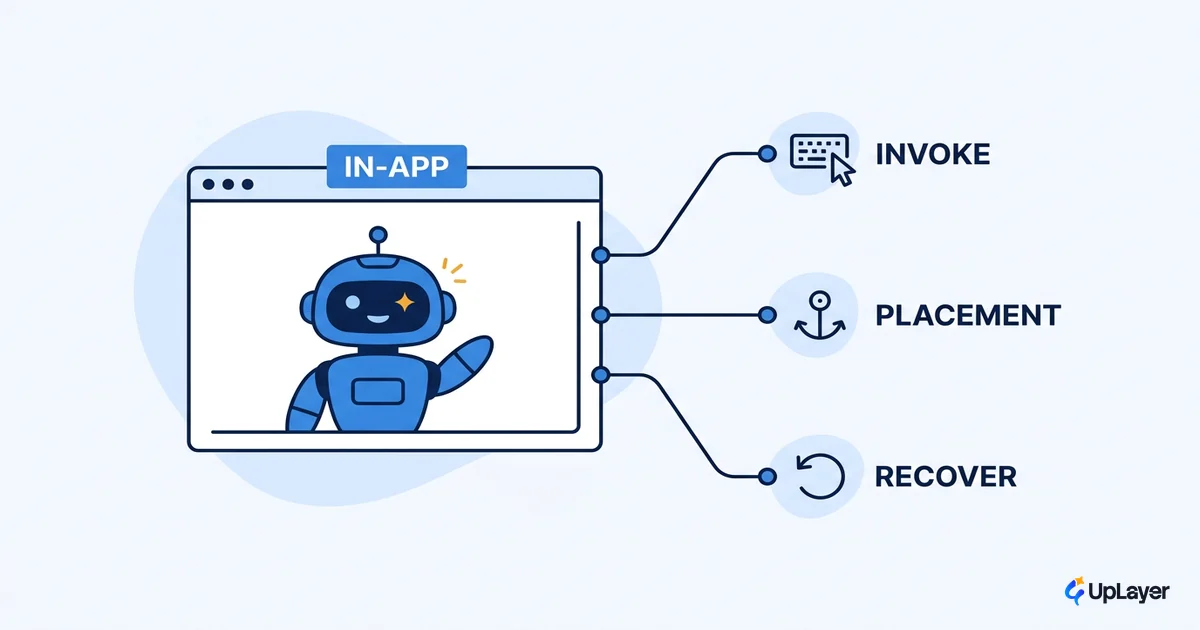
Most in-app AI assistants fail the same way. A chat bubble lands in the bottom-right corner, the launch goes out, and three weeks later the invocation rate is a rounding error. The model works fine. The feature still moved nothing.
That outcome is a design problem, not a model problem. An in-app AI assistant that gets used is built around three decisions: where it lives, how users summon it, and what happens when it gets something wrong. Get those right and it reads as part of the product. Get them wrong and it reads as a bolted-on chatbox you have to apologize for.
This piece is about those three decisions, the patterns that follow from each, and how to tell whether the result is actually earning its place. We build supportive AI layers on top of products people already use, so we treat placement, invocation, and recovery as the work, not as polish on top of a prompt.
Where an in-app AI assistant lives is the first design decision
Placement is the highest-leverage call you make, and you make it before any prompt engineering. An in-app AI assistant can live in three homes: a global command surface (a palette or command bar you call from anywhere), a persistent sidebar that travels with the user, or inline at the exact point of action. The right home depends on the work the user is doing when they need help, not on which one is easiest to ship.
The instinct to start with a full sidebar chat is usually the wrong one. It is easy to build and it demos well, which is exactly why it gets chosen for the wrong reasons. A sidebar that hangs around during focused single-step work is clutter. The better pattern is often the quieter one. This is the same logic behind progressive disclosure, which defers advanced or rarely used features to a secondary surface so the common path stays simple. An assistant should follow that grain: surface the help that fits the moment, keep the rest one deliberate step away.
If you are mapping this against your broader product, we cover the full trust-and-architecture picture in designing AI assistants for B2B SaaS that earn trust. This post zooms into the placement, invocation, and recovery layer of that work.
Should an ai assistant be a sidebar or inline
The honest answer is that it depends on the shape of the task, and a single product often needs more than one pattern. Open-ended, multi-turn work wants a surface that persists. A single suggestion at a known decision point wants to appear and disappear in place. Quick navigation or one-shot actions want a command bar. The table below is the decision we walk clients through, and it maps each pattern to the metric it should move.
| Pattern | Best for | Cost if misused | Metric it should move |
|---|---|---|---|
| Persistent sidebar | Multi-turn, exploratory, "help me think" work | Clutter and ignore-blindness on focused screens | Task completion, session depth |
| Inline / in-context | One suggestion at the point of action (a field, a row, a draft) | Feels intrusive if it fires unprompted | Activation, first-useful-action rate |
| Command bar / palette | Navigation, quick actions, "take me to X" | Hidden if there's no visible affordance (users won't recall a shortcut they never saw) | Time-to-task, power-user retention |
Notice that none of these is "a chatbox by default." The default chatbox is a tax you charge every user for a pattern that only some tasks need. When a conversational surface is the right call, it still has to earn its place by doing real work, which is the case we make in an AI chatbot for SaaS that does more than answer FAQs. We go deeper on the full set of these in AI assistant UX patterns; the point here is that the choice is a product decision tied to a number, not a styling preference.
NOTE
Pick the pattern from the task, then pick the metric it should move, then build. If you cannot name the metric a pattern is meant to move, that is the signal to cut it, not ship it.
How do users discover an in-app assistant
Discovery is where most assistants quietly die. The feature exists, the model is good, and nobody finds it. The fix starts with a basic principle of interface design: lean on recognition rather than recall, which means making actions and options visible instead of asking users to remember that a hidden assistant exists. A keyboard shortcut with no visible affordance is invisible to everyone who didn't read the changelog.
The second move is to resist the launch tutorial. Upfront walkthroughs feel like teaching, but NN/g research finds that users frequently skip them, don't remember them, and don't perform tasks better afterward. Contextual, pull-based help that appears at the moment of need beats a modal nobody reads. Put the assistant's entry point where the relevant work happens, and use empty states as invitations rather than dead ends.
Here is the discovery checklist we run, written as a config you can hand to engineering:
assistant_discovery:
  visible_affordance: true        # a button or entry point, not just a shortcut
  keyboard_shortcut: "cmd+k"      # for power users, never the only path
  contextual_entry_points:        # appear where the relevant work happens
    - empty_states: "offer a first action, not a blank screen"
    - point_of_friction: "surface near the task that's hard"
  onboarding_style: contextual    # pull, in-context; not an upfront tutorial
  suggested_prompts: true         # solve the blank-box problem (see below)
The AI assistant design principles we work from treat discovery as a first-class surface, not an afterthought you bolt on once the model is wired up.
Invocation: how users summon and steer the product copilot
Once a user finds the assistant, invocation is the question of how they summon it and tell it what they want. A product copilot needs a visible trigger, a fast keyboard path, and contextual prompts that the user can run without staring at a blank box. That blank box is a real failure mode. With AI, the user tells the computer what outcome they want rather than how to do it, and Nielsen's point is that current chat interfaces have deep usability problems because a large share of people are not articulate enough to write a good prompt from scratch.
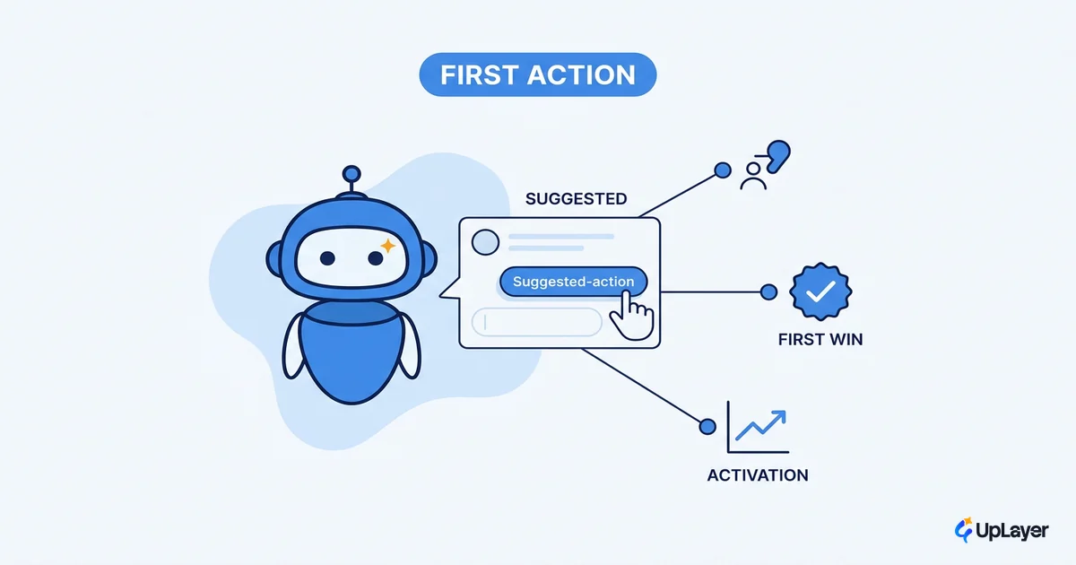
So do the articulating for them. Offer suggested prompts tied to the current context. Show what the assistant can do here, in this view, on this object, rather than a generic "ask me anything." Keep the user steering at all times: every invocation should be easy to start, easy to refine, and easy to abandon. Supportive AI assists the person doing the work; it never seizes the wheel.
Recovery is the pattern that earns trust, or loses it
Everything above gets the assistant used once. Recovery decides whether it gets used again. Recovery is what happens when the assistant is wrong, and it is the single most under-designed surface in this category. Most teams design the happy path and treat the failure path as an afterthought, which is exactly backward for a feature whose output is probabilistic.
Three things make recovery work. Signal confidence so users know when to double-check. Make undo and escape trivial, so a wrong answer costs a click, not a cleanup. And write errors that follow the same standard as the rest of your product: visible, in plain language, with a constructively suggested solution instead of a dead end. For any action that touches money, data, or a customer-facing surface, keep a human in the loop before it commits.
WARNING
Shipping an in-app AI assistant without a recovery path is how trust dies on the first wrong answer. If you cannot show users the assistant was wrong and let them fix it in one step, the feature is not ready. This is supportive AI: a layer that supports the user's judgment, never a system that overrides it.
How to tell if your in-app AI assistant is working
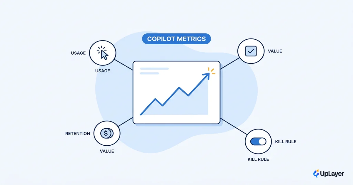
A finished pattern is not a result. Tie the in-app AI assistant to a metric you already track and watch the delta. The instrumentation is straightforward: invocation rate (do people find and summon it), first-useful-action rate (does the first interaction produce something they keep), task completion, and retention of users who invoke the assistant versus those who never do. If invokers don't retain better, the assistant is decoration.
Most AI features ship and move nothing. The ones that move a metric are designed around the user's task and the user's recovery, not around the model. Define the number first.
In a Concept Demo we built to show this thinking, an inline assistant placed at the point of friction is designed to lift first-useful-action rate well above a corner-bubble baseline, because the help arrives where the work is rather than where the widget happens to live. The projection is the point: you can model the lift before you build, then measure the real delta after. That is also the spine of increasing AI adoption across a product, and an assistant is one of the clearest places to prove it.
A native-feeling in-app AI assistant is a design outcome, not a model outcome. Get placement, invocation, and recovery right and the assistant reads as part of the product, earns a second invocation, and moves a number you can defend to your board. Start from the task and the metric, decide which patterns actually earn their place, and design the moment the assistant is wrong as carefully as the moment it is right.
TIP
Want to know which AI feature will move a metric you already track, before you build it? How the AX Audit works.