AI design principles for supportive features
A short set of AI design principles that keep features supportive, legible, and accountable to a metric your team already tracks, plus how to set them.
 Shahriar P. ShuvoAI Product & UX Design7 min read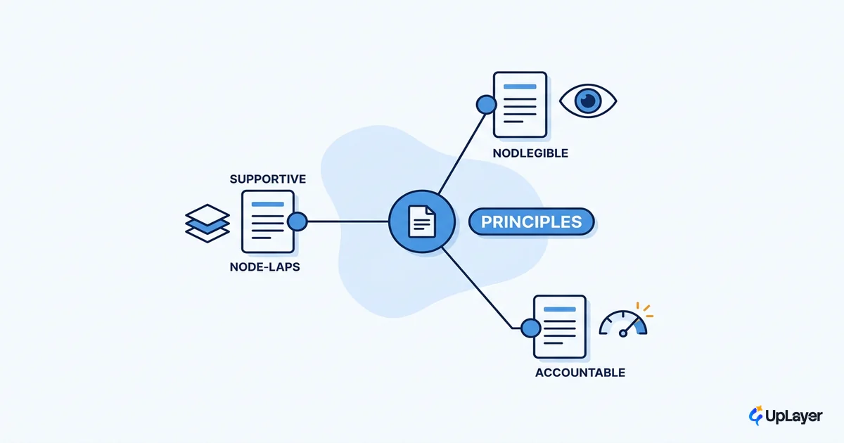
Most AI design principles read well and govern nothing. A team writes "be transparent, be helpful, be human" on a slide, ships the feature anyway, and the principles never block a single decision. That is the problem with how AI design principles usually get written. They are aesthetic, not accountable.
We treat principles differently. A principle that does not change a shipping decision is decoration. The set below is short on purpose, and every rule names the number it protects. The goal is to keep an AI feature supportive, legible, and tied to a metric you already track, because the alternative is a feature that demos well and moves nothing. If you want the deeper version of the trust side, we cover it in designing for AI uncertainty without losing trust.
This is a working set, not a manifesto. Read it as rules you can paste into a design doc and hold a team to.
What are the principles of good AI design
Good AI design keeps the feature supportive, legible, and accountable to a metric. Supportive means the AI assists the user's existing job rather than replacing the product's core. Legible means the user can tell what the AI did and how sure it is. Accountable means the feature is tied to one number you can move, and you will remove it if that number does not move.
That definition is deliberately narrow. Plenty of writing on AI design principles drifts into fairness, ethics, and brand tone. Those matter, but a product team cannot ship against "be fair" on Tuesday. The principles here are the ones that change what you build and what you cut. Each is a rule plus the metric it defends.
The five AI design principles for supportive features
Here is the full set. The value is in the right two columns: the metric each principle protects, and what failure looks like when you ignore it.
| Principle | The rule | Metric it protects | Failure mode |
|---|---|---|---|
| Supportive over central | The AI assists a job the user already does; it never becomes the only way through | Retention, activation | A chat box bolted on top that users open once |
| Legible by default | The user can see what the AI did and how confident it is | Trust, task success | Silent automation users cannot verify or undo |
| Accountable to a metric | Every AI feature names one number it must move before it ships | Projected ROI | A feature that ships and moves nothing |
| Recoverable when wrong | Wrong output is cheap to catch, correct, and reverse | Error rate, task success | Confident wrong answers that cost the user real work |
| Quiet until useful | The AI stays out of the way until it has something worth surfacing | Engagement quality | Notification noise that trains users to ignore it |
The test for whether something is a real principle is simple. If you cannot name the decision it would block, it is not a principle.
PRINCIPLE TEST
  rule           = one sentence a reviewer can apply
  metric         = the single number it protects
  blocks         = the design decision it would stop
If blocks == "" then it is decoration, not a principle. Cut it.
Note the overlap with broader AI UX best practices: these principles are the subset that survives contact with a roadmap. They are written to be vetoed against, not admired.
Make the AI legible: show what it can do and when it is unsure
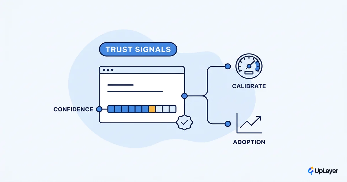
Legibility is the first principle people skip, and it is the one that breaks trust fastest. The user needs to know what the AI can do before they rely on it, what it just did, and how confident it is. This is the core of good human AI interaction design.
You do not have to invent this from scratch. Microsoft's 18 guidelines for human-AI interaction are organized exactly around the moments that matter: what to make clear upon initial interaction, during interaction, when the system is wrong, and over time. Most legibility failures map to a guideline a team skipped at one of those four moments.
Confidence is the part teams get wrong most often. Google's PAIR team is direct that explaining what the AI did and how sure it is is what lets users calibrate trust rather than over-trust or abandon the feature. A confidence signal is not decoration. It changes whether the user double-checks the output or ships it blind, which is exactly the kind of decision a principle should govern.
IMPORTANT
Legibility is not a "transparency" checkbox. The test is whether a user can answer three questions without help: what can this do, what did it just do, and how sure is it. If any answer is "I cannot tell," the feature is not legible yet.
These are the kinds of AI design patterns that earn their place: a visible confidence state, an explanation on demand, and a clear boundary on what the AI will and will not attempt.
Keep AI supportive, not central: design for the assist
Supportive AI sits on top of a product that already works. The AI is a layer, not the foundation. When the model is unavailable or wrong, the core product still does its job. This is the principle that keeps a model swap from taking the product down, and it is why we describe what we build as a supportive layer rather than an AI product.
The strongest argument against centering AI comes from usability, not caution. Nielsen Norman Group points out that today's chat-first interfaces carry deep-rooted usability problems and that the real shift is toward intent-based interaction, where users state the outcome they want and the system handles the path. A chat box in the corner is rarely the answer. The assist that lives inside the workflow the user is already in usually is.
Supportiveness is measurable. If the AI feature is central and users route around it, retention and activation tell you. If it is supportive and lands, the same metrics move in your favor. That is the connection between this principle and AI UX patterns that drive adoption: adoption is downstream of whether the feature helps the job the user already came to do.
Tie every principle to a metric you already track
This is the principle that makes the other four enforceable. Every AI feature names one number it must move before it ships, and you measure the delta against that number after. No metric, no ship. These are the AI UX best practices that separate a feature that earns its place from one that just adds surface area.
The pressure to add AI is real and rising, which is exactly why the discipline matters.
78% of organizations reported using AI in 2024, up from 55% the year before, according to the Stanford HAI 2025 AI Index Report.
Adoption that fast means most teams are shipping AI under pressure, and pressure produces features that demo well and move nothing. A principle tied to a metric is the cheapest defense against that. Pick the number first: retention, activation, conversion, or expansion. Then design the feature to move it, and be willing to remove the feature if it does not. The mechanics of that measurement are their own topic, which is why we keep a full guide on how to measure the ROI of an AI feature.
WARNING
A feature without a named metric is not a small risk. It is the default failure mode. It ships, it looks like progress, and six months later nobody can say what it changed. Define the metric before the model.
How do you set AI design principles for a team
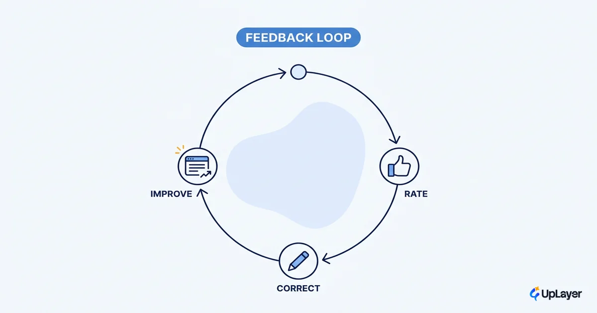
Setting AI design principles for a team is a four-step loop, not a slide. The point is to make the principles operational so they show up in real reviews.
- Write each rule as one reviewable sentence. If a designer cannot apply it during a review without interpretation, it is too vague. Rewrite until it is a yes-or-no test.
- Name the metric each rule protects. Map every principle to a single number from the set the team already tracks. A principle without a metric does not survive the next deadline.
- Gate the design review on the principles. Put them in the review template so a feature cannot pass without answering to each one.
- Cut what fails the test. When a feature cannot name the decision a principle would block, or the metric it should move, it does not ship. Saying no here is the whole point.
REVIEW GATE (paste into your design-review template)
  [ ] supportive: core product still works if the model is gone
  [ ] legible:    user can see what it did + how sure it is
  [ ] accountable: one named metric, with a projected target
  [ ] recoverable: wrong output is cheap to catch and reverse
  [ ] quiet:      it stays silent until it has something useful
Any unchecked box blocks the ship until resolved.
Run this loop once and the principles stop being decoration. They start cutting features, which is how you know they are real.
Good AI design principles are not a values statement. They are a small set of rules that keep an AI feature supportive, legible, and accountable, applied at the review where shipping decisions actually get made. Write them so they can be vetoed against, tie each one to a metric you already track, and the next AI feature you ship will have to earn its place before it goes live.
TIP
Want to know which AI feature is worth building, and the single metric it should move, before you write a line of code? How the AX Audit works.