AI UX patterns that drive feature adoption
A field guide to the AI UX patterns that drive feature adoption, each one mapped to the exact activation, trust, or retention metric it actually moves.
 Shahriar P. ShuvoAI Product & UX Design11 min read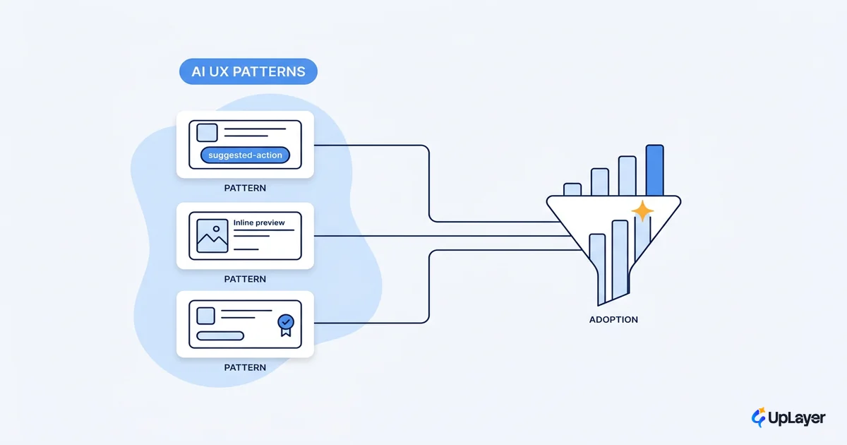
Most AI features fail at the interface, not the model. The pipeline works in a demo, the team ships, and the usage chart stays flat. The reason is rarely the model's accuracy. It is that users do not know the feature exists, do not trust its output, or cannot tell whether a given answer is safe to act on. The AI UX patterns you choose decide all three.
This is a field guide to the AI UX patterns that actually drive feature adoption, written for product teams who have to defend a number. Each pattern below comes with a one-line definition you can quote, the specific metric it moves, the moment to reach for it, and a real product that ships it well. We have tied every pattern to a metric you already track, because an AI feature that does not move a number is theater, however good the interaction feels.
The patterns are not interchangeable. A confidence signal fixes a trust problem and does nothing for a discoverability problem. Pick the pattern that matches the gap in your funnel, ship it as a supportive layer over your core product, and measure the delta. That is the whole job.
The pattern library at a glance
Here are the seven AI UX patterns this guide covers, the primary metric each one moves, and the product to study for each. Use the table to jump to the gap you actually have, then read the section that matches it. The first practical move is always the same: tie the pattern to a number, the way we do in how to design AI features users actually adopt.
| Pattern | Primary metric it moves | When to reach for it | Study this product |
|---|---|---|---|
| Inline suggestions | Adoption, time-to-task | The action already happens in an editor or flow | GitHub Copilot, Cursor |
| Confidence signals | Trust, action rate | Output quality varies and a wrong answer is costly | Linear, triage tools |
| Citations and sources | Trust, verification rate | Users must defend the output to someone else | Perplexity |
| Undo and override | Trust, activation | The AI takes an action, not just makes a suggestion | Notion AI, email assistants |
| Streaming responses | Perceived speed, completion | Generation takes more than a second | ChatGPT, most copilots |
| Human-in-the-loop approval | Trust, safe-action rate | The action is irreversible or high-stakes | Support and finance copilots |
| Progressive disclosure | Discoverability, activation | The feature is powerful but buried | In-product assistants |
These are the AI design patterns that earn their place. Each one removes a specific barrier between a user and the value your feature creates, and each one drives AI feature adoption by closing a different gap. The sections below take them in turn.
Inline suggestions: meet the user mid-action
An inline suggestion is AI output rendered in place, inside the field or flow the user is already working in, accepted or dismissed with a single keystroke. It is the highest-adoption AI UX pattern because it removes the two biggest barriers to use at once: switching context and forming a prompt.
The mechanism is that the feature meets the user mid-action instead of waiting to be summoned. There is no separate panel to open and no blank box to fill. The user keeps typing, a faded suggestion appears, and a tab key accepts it. Adoption climbs because the cost of trying the feature drops to almost nothing, and time-to-task falls because the suggestion arrives before the user has finished thinking.
This is why inline suggestions move two metrics at once. In GitHub's controlled study of 95 developers, the group using Copilot completed the task 55 percent faster than the group without it, and finished it more often.
Developers using GitHub Copilot completed the task 55% faster (1 hour 11 minutes versus 2 hours 41 minutes) and had a higher completion rate (78% versus 70%). The result was statistically significant at P=.0017.
Cursor's Tab model extends the same pattern by predicting not just the next edit but the next place the cursor should jump, so the suggestion follows the user through the file. The lesson for any SaaS is direct: if the action you want to accelerate already happens in a text field, a table, or a form, inline is the first pattern to reach for.
When to use it: the target action lives inside an editor, a composer, or a structured input where a single accept keystroke makes sense. When not to: if the user has to leave their flow to even see the suggestion, you have a discoverability problem instead, and progressive disclosure further down this list is the better fit.
Confidence signals: tell users how much to trust each answer
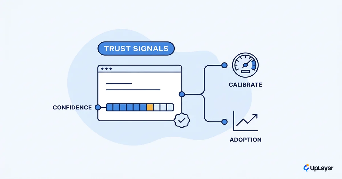
A confidence signal is a visible cue that tells the user how certain the AI is about a specific output, so they can calibrate how much to trust it before acting. It is the pattern that turns a black box into something a careful professional will actually use.
The mechanism is calibration. AI output quality varies answer to answer, and users have no way to see that variance unless you show it. A confidence signal, whether a labeled tier ("high confidence"), a score, a hedge in the copy, or a visual treatment that flags low-certainty results, lets the user spend their attention where it is needed. They act fast on the confident answers and scrutinize the shaky ones. Without the signal, users either trust everything and get burned, or trust nothing and abandon the feature. Both kill adoption.
This is the pattern that most directly moves trust, and trust is what converts a one-time try into repeat use. The supportive-AI principle here is concrete: never present a low-certainty result with the same authority as a high-certainty one. Tools that auto-triage or auto-classify, including Linear's intake and routing, lean on this by surfacing a suggestion the human can accept rather than a silent decision they cannot see. This is the supportive-layer stance that runs through designing AI products that stay reliable: the model assists, the user keeps control. The metric to watch is action rate on AI suggestions. A well-built confidence signal raises it on the strong answers without inflating it on the weak ones. We cover the deeper version of this in designing AI confidence and trust signals.
When to use it: output quality is genuinely variable and a wrong answer carries a real cost. When not to: if your model's output is uniformly reliable, a confidence badge just adds noise and slows people down.
Citations and sources: let users verify before they act
A citation pattern attaches the source behind every AI claim as a clickable reference the user can open to check the answer themselves. It is the difference between "trust me" and "here is where this came from," and for any output a user has to defend to someone else, it is not optional.
The mechanism is borrowed credibility plus accountability. When the AI cites its sources, the user does not have to trust the model. They trust the source, and they can check it in one click. Perplexity built its entire product around this: every answer ships with clickable citations so you can verify the information or dig deeper, which is precisely why people rely on it for research they will repeat to a boss or a client.
Citations move the verification rate, a leading indicator of trust and of repeat use in knowledge-work tools. A user who can verify an answer in five seconds will use the feature for the work that matters. A user who cannot will keep it for low-stakes throwaway tasks and never adopt it for the high-value ones. For retrieval and summarization features especially, citations are the pattern that makes the serious use cases possible. This is one of the AI transparency patterns users can read rather than take on faith.
When to use it: the output is factual, the user has to stand behind it, or the answer draws on documents the user can inspect. When not to: for purely generative or stylistic output where there is no source to point to.
Undo and override: make AI actions reversible
Undo and override is the pattern that guarantees any AI action can be reversed or corrected by the user, instantly and without penalty. It is what makes people willing to let the AI do something rather than only suggest something.
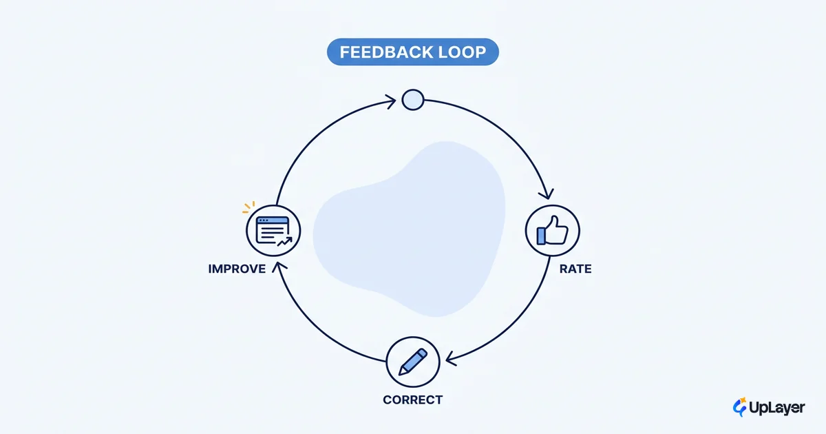
The mechanism is psychological safety. The moment an AI feature moves from suggesting to acting, the user's risk goes up. A bad suggestion is ignored, but a bad action has to be cleaned up. A visible, trustworthy undo collapses that risk back down. When a user knows they can reverse anything the AI did, they try the riskier, higher-value actions, which is exactly where the adoption gains live. Each undo and edit is also a correction worth capturing, and the feedback loops you design into an AI feature turn those corrections into a system that gets better instead of one that repeats the same miss. Notion AI's rewrite and edit actions work this way. The AI changes the document, but the change is a normal edit the user can undo like any other, so accepting an AI rewrite feels no more committal than typing.
This pattern moves both trust and activation, because the first AI action a user takes is the activation moment, and they will only take it if they believe they can walk it back. The design rule is that the undo must be obvious and fast, not buried in a menu. If reversing the AI's work takes more effort than doing the work by hand, the safety net does not exist.
When to use it: the AI performs an action with a visible result, like editing content, moving data, or sending something. When not to: it is never wrong to offer undo, but it matters most where actions have consequences, which is also where human-in-the-loop may be the stronger pattern.
Streaming responses: show the work as it happens
Streaming is the pattern of rendering AI output token by token as it generates, instead of making the user wait for the complete response. It is a perceived-performance pattern, and perceived performance is the thing users actually feel.
The mechanism is that streaming converts dead waiting time into progress the user can watch. A four-second blank spinner reads as broken. Four seconds of text appearing word by word reads as fast and alive, even though the total time is identical. This maps directly onto the one-second limit on a user's flow of thought: past roughly a second, attention starts to drift unless the interface keeps signalling progress. Streaming lets the user start reading the beginning of the answer while the end is still generating, so the effective wait shrinks to time-to-first-token rather than time-to-full-response. ChatGPT made this the default expectation, and nearly every production copilot now streams because the alternative feels broken by comparison.
Streaming moves perceived speed and, through it, completion rate, because the longer a spinner sits the more users abandon. It is also a trust signal in disguise. Visible generation tells the user the system is working on their specific request, not returning a canned result. The implementation rule is to optimize time-to-first-token above all, since that is the number the user's patience is measured against.
When to use it: any generation that takes longer than about a second. When not to: for instant lookups or very short outputs, where streaming a three-word answer just looks fussy.
Human-in-the-loop approval: keep a person on high-stakes actions
Human-in-the-loop approval is the pattern where the AI proposes a high-stakes action and a person confirms it before anything executes. It is the pattern that lets you ship AI into serious workflows without betting the company on the model being right every time.
The mechanism is a deliberate checkpoint. The AI does the heavy lifting, drafting the reply, proposing the refund, suggesting the data change, and a human gives the final yes. This keeps the speed benefit of the AI while keeping a person accountable for anything irreversible. It is the supportive AI position in its clearest form: the model supports the decision, it does not own it. This checkpoint is one of the AI design principles that keep a feature trustworthy, the rule that automation should track the cost of being wrong rather than chase what demos well. The cost of a checkpoint is one click. The cost of a wrong autonomous action in support, finance, or operations is a customer, a chargeback, or a breach.
This pattern moves trust and, specifically, the safe-action rate, the share of AI-initiated actions that complete without causing a problem. For any feature that touches money, customer-facing communication, or anything you cannot cleanly undo, the approval step is what makes adoption possible at all, because no responsible buyer will turn on full autonomy for those flows. The design discipline is to make approval fast and informative, showing the user exactly what will happen so the review is real and not a rubber stamp.
WARNING
The most expensive mistake in AI UX is shipping a pattern because it looked impressive in a competitor's product. Autonomy demos well and moves nothing if your users will not trust it. Match the pattern to the barrier in your funnel, not to what is fashionable.
When to use it: the action is irreversible, regulated, or customer-facing. When not to: for low-stakes, easily reversed actions, where an approval step adds friction and an undo is enough.
Progressive disclosure: surface the feature at the moment it is useful
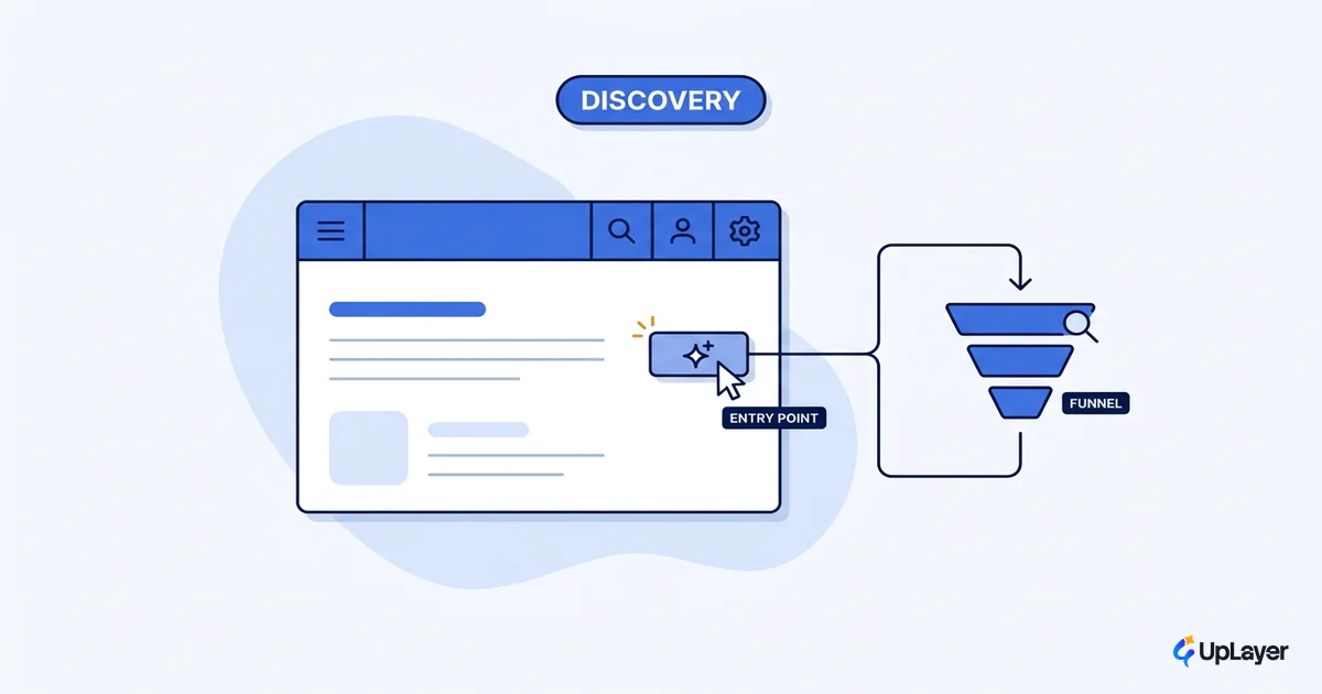
Progressive disclosure is the pattern of revealing an AI feature's capability gradually, in context, at the moment it becomes useful, rather than dumping every option on the user up front. It is the answer to the most common adoption failure of all: nobody knows the feature is there.
The mechanism is timing. A powerful AI feature presented as an empty chat box or a long menu of commands overwhelms new users and gets ignored. The principle Nielsen calls progressive disclosure is to show only the few most important options first and reveal the rest on request, which makes an interface easier to learn and less error-prone. Applied to AI, that means surfacing the relevant capability exactly when the context calls for it: a contextual suggestion chip, a slash-command hint, an inline prompt that appears next to the thing the user is looking at. Each touch teaches one capability without asking the user to read a manual. Adoption rises because discovery happens during real work, and activation rises because the first action is small and obviously relevant. Sequencing those first touches is its own craft, which is why the onboarding you design for an AI feature decides whether a capable feature ever gets a first try.
This pattern moves discoverability and activation, the two metrics most teams forget to measure and then blame the model when usage is flat. The honest diagnosis is usually that the feature was undiscoverable, not unwanted. Linear's in-product surfaces and Notion's contextual AI menus both use this, meeting the user where they already are instead of forcing a trip to a separate AI mode. For the full activation playbook, see making AI features discoverable in your product.
When to use it: the feature is capable but buried, or adoption is stalling at first discovery. When not to: for a single obvious action that needs no teaching, where extra layers just hide it.
Which AI UX patterns increase adoption, and what makes an AI feature get used
The short answer to which AI UX patterns increase adoption is the one that closes the specific gap in your funnel. The wrong pattern is any pattern chosen because it looked good somewhere else.
What makes an AI feature get used is not novelty. It is the removal of a barrier. Inline suggestions remove the barrier of context-switching. Confidence signals and citations remove the barrier of distrust. Undo and human-in-the-loop remove the barrier of risk. Streaming removes the barrier of perceived slowness. Progressive disclosure removes the barrier of not knowing the feature exists. Diagnose which barrier is actually flattening your usage chart, then ship the matching pattern and measure the metric it is supposed to move. If the metric does not move, you had the wrong diagnosis, not a bad model.
A practical sequence helps. Start by instrumenting where users drop off, then map the drop to a barrier, then to a pattern, then to the metric you expect to move:
DIAGNOSE → MATCH → MEASURE

Barrier in the funnel        Pattern to ship             Metric to watch
-----------------------      ----------------------      ----------------------
Never discovers it      →    Progressive disclosure  →   Discoverability, activation
                             + inline placement
Never trusts output 1   →    Confidence signals      →   Action rate, verification
                             + citations
Never takes the risky   →    Undo + override         →   Activation, safe-action rate
action that pays off         + human-in-the-loop
Abandons during wait    →    Streaming               →   Perceived speed, completion

Rule: the pattern is downstream of the metric, never the other way around.
Read the table this way: find the row that matches where your users stall, ship that pattern, and watch only the metric in the right-hand column. If you cannot name the barrier, you are not ready to pick a pattern yet.
| If your problem is... | The barrier is... | Reach for... |
|---|---|---|
| Flat usage, nobody opens it | Discoverability | Progressive disclosure, inline placement |
| Users try once, never return | Distrust of the output | Confidence signals, citations |
| Users will not let it act | Perceived risk | Undo, override, human-in-the-loop |
| Users quit mid-generation | Perceived slowness | Streaming |
These AI UX best practices share one spine: every pattern is a supportive layer that helps the user act with more confidence and less risk, never automation theater that demos well and moves nothing. The teams that win with AI UX patterns are the ones who treat the interface as the place adoption is won or lost, pick the pattern that fixes their real barrier, and hold themselves to the metric it was supposed to move. Build the pattern, measure the delta, and let the number tell you whether you were right.
TIP
Want to know which pattern, and which metric, will pay off before you write the code? How the AX Audit works.