AI transparency patterns users can actually read
AI transparency patterns that show sources, reasoning, and limits so users trust the output, ranked by the metric each one moves. What to build and skip.
 Shahriar P. ShuvoAI Product & UX Design7 min read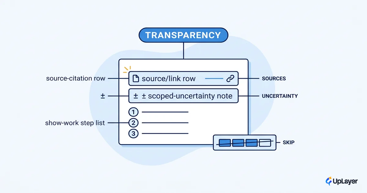
Most AI transparency in shipping products is theater. A confidence bar the model cannot actually justify, a "reasoning" panel that reads like a courtroom transcript, a glowing "AI-powered" badge that tells the user nothing. These decorate the screen and move no trust. The useful AI transparency patterns do the opposite: they show sources, reasoning, and limits so a person can judge what the AI did and decide whether to rely on it. That is the whole job.
We start from a position, not a checklist. Transparency is a supportive layer, and a supportive layer earns its place by moving a metric you already track. If a pattern does not change how many users finish the task, come back to the feature, or stop second-guessing the output, it is cost without return. The same discipline runs through the AI UX patterns that drive feature adoption: show the work where it changes a decision, and nowhere else.
This piece sorts the patterns that users can read from the ones that fake rigor, and ties each to the number it should move.
What AI transparency patterns actually are (and what they're not)
AI transparency patterns are interface conventions that expose the inputs, the process, and the limits of an AI output so the user can evaluate it instead of trusting blind. Sources behind a claim. The steps an agent took. What the system is unsure about. The boundary of what it can do.
What they are not: a synonym for "explain the model." You cannot explain a large language model to a user in a tooltip, and you should not try. The goal is not to teach how the weights work. The goal is to give the skeptical user a way to check, fast, at the moment of the decision.
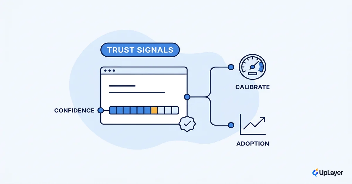
The failure mode worth naming is transparency theater: UI that performs rigor without delivering it. A percentage that looks calibrated but is invented. A step-by-step trace that was written after the answer to look thoughtful. These are worse than showing nothing, because false confidence is more expensive than honest silence.
WARNING
A confidence score the model cannot defend is not a transparency feature. It is a liability. Users calibrate to the number, the number is wrong, and they trust the next wrong answer harder.
The three patterns worth building
Three patterns carry almost all of the trust value, and each maps to a metric you can already see in your dashboard.
The first is source attribution, also called grounding: show the documents or data the answer was built from, with a link the user can click. The burden of proof moves to where it belongs. The second is scoped uncertainty: when the model is guessing at intent, say so and offer two to four scoped options instead of silently picking one. A silent wrong guess is the most expensive kind, because the user never knew a choice was made. The third is show-work: for any multi-step or agentic task, reveal the plan and progress. Show-work patterns like a dynamic checklist turn a long pause into visible progress, so a delay reads as the system working rather than the system frozen.
| Pattern | What it shows | Metric it moves | Build cost |
|---|---|---|---|
| Source attribution / grounding | Linked evidence behind each claim | Trust-linked retention on the AI feature | Medium: needs retrieval + citation plumbing |
| Scoped uncertainty | 2 to 4 options when intent is ambiguous | Task completion, fewer silent wrong guesses | Low: a UI fork plus a "not sure" branch |
| Show-work / audit trail | Plan, steps, and progress of an agent | Patience on long tasks, abandonment rate | Medium: requires step events from the pipeline |
Pick by the metric, not by the demo. If your AI feature's problem is that users do not trust the output enough to act on it, attribution is your lever. If the problem is abandonment mid-task, show-work is. We go deeper on the calibrated version of these in AI confidence and trust signals.
Designing for AI uncertainty: show limits, not fake confidence
Designing for AI uncertainty starts with an uncomfortable fact: the model usually cannot hand you a calibrated confidence number, and the "reasoning" it shows may not be real. Nielsen Norman Group is blunt about this. The explanations LLMs surface today are often inaccurate, hidden, or confusing, and a step-by-step walkthrough is frequently a rationalization generated after the answer rather than a faithful trace of how the model got there.
So do not ship the percentage you cannot defend. Use structure as the honesty signal instead. When the system is unsure, surface the uncertainty as a choice the user can resolve, not a decimal they have to interpret.
# Decision rule: when to surface uncertainty in the UI

if intent_is_ambiguous:
    show 2 to 4 scoped options       # let the user pick, do not guess
elif answer_has_external_sources:
    show grounding links             # let the user verify
elif task_is_multi_step:
    show plan + progress             # let the user follow along
else:
    show a short answer, expandable  # do not manufacture a confidence score

# Never: display a confidence % the model cannot justify.
This is the same logic we apply across designing for AI uncertainty without losing trust: honesty about limits builds more durable trust than a confident guess, because the first wrong answer behind a fake certainty signal costs you the user's belief in every answer after it.
How do you make AI decisions transparent in the UI?
Lead with a short answer, then let users open the detail. Progressive disclosure is the workhorse of human AI interaction design: the confident user moves fast on the summary, the cautious user expands to see the sources, the reasoning, or the alternatives. One layout serves both without forcing a wall of explanation on anyone.
In practice that means a result, a "based on" line with linked evidence, and an optional "show steps" affordance. The default view stays calm. The depth is one click away for the user who wants to check.
TIP
Make the expandable detail genuinely useful, not decorative. If "show reasoning" opens a paragraph that does not change what the user would do next, cut it. Transparency that does not change a decision is just more pixels.
What should you disclose about how AI works?
Separate two things that get conflated: the legal floor and the design goal. The floor is disclosure. Under the EU AI Act, providers must inform people they are interacting with an AI system, and systems that generate synthetic content must mark their outputs as artificially generated. That is the minimum: tell users it is AI, mark AI-generated content, and be honest about what the feature cannot do.
The goal sits above the floor. Disclosure tells users a system is AI. Good design tells them whether to trust this particular output. The strongest approach treats explanation as a design problem rooted in user needs. A systematic review of explainable-AI research lays out a five-stage, user-centered design process that begins with contextual inquiry into what users actually need to know, not with the model's internals. Those are the AI design principles worth adopting: disclose by law, design by need.
So disclose three things plainly. That the user is talking to AI. That a given output was AI-generated. What the system is not reliable at. Everything past that should be earned by the metric, not added because a checklist said so.
What this costs you to skip: the metric view
Skip transparency and you do not lose a compliance box, you lose trust you can measure. The pattern is visible in the dashboard: users open the AI feature, do not act on its output, and drift back to the manual path. That is a retention and activation problem wearing a UX costume.
The market is moving the same direction. Stanford's AI Index notes the responsible-AI ecosystem is evolving unevenly: incidents are rising while standardized evaluations stay rare, and governments are converging on transparency and trustworthiness as the baseline. The teams that treat transparency as a metric lever now will not be retrofitting it under pressure later.
Here is the discipline. Before you build any transparency pattern, name the metric it should move and the current number. Source attribution should lift action-on-output. Scoped uncertainty should lift task completion. Show-work should cut mid-task abandonment. If you cannot name the metric, you are about to build theater. In a Concept Demo we would wire one pattern to one metric and project the delta before writing production code, the same way we treat any other AI design pattern and the metric it moves.
Transparency is not a virtue you add at the end. The AI transparency patterns that survive contact with real users are the few that let a skeptic check the work and change what they do next. Build those, name the number each one moves, and let the rest go.
TIP
Want to know which AI transparency pattern would actually move a metric in your product, with a working concept demo of the highest-ROI one? How the AX Audit works.