Designing AI confidence and trust signals
AI trust signals design done right: show how sure the model is so users calibrate reliance, adopt the feature, and stop over- or under-trusting output.
 Shahriar P. ShuvoAI Product & UX Design7 min read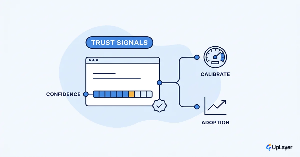
Most teams reach for a trust signal after an AI feature underperforms. Adoption is flat, so someone adds a confidence badge or a disclaimer and hopes it helps. That order is backwards. Good ai trust signals design is not a garnish you bolt on at the end. It is part of the feature itself, because the signal is what tells a user when to rely on the output and when to check it.
Get it wrong in either direction and the feature stalls. Users who over-rely get burned by one bad answer, lose faith, and quietly stop using the feature. Users who under-rely never trust it enough to adopt it in the first place. The goal is not maximum trust. It is calibrated trust: the user relies on the model when it is right and double-checks it when it matters.
That distinction is the whole job. This piece covers what the signals are, when each one earns its place, and how to tie them to a metric you already track instead of treating them as a moral checklist.
What "ai trust signals design" actually means
A trust signal is any element of the interface that communicates how sure the model is, where its answer came from, or what to do if it is wrong. The design work is choosing those elements so users calibrate reliance, not so they trust everything you ship.
The reason this matters is that users arrive skeptical. The U.S. public is more concerned than excited about AI, which means a new AI feature starts in a trust deficit. One confident, wrong answer with no signal to flag it confirms the user's suspicion, and you lose them. Calibration is how you climb out of that deficit without faking certainty you do not have.
We treat this as part of designing for AI uncertainty, not a separate accessibility pass. The target is concrete: calibrated reliance shows up as feature adoption that holds, and as fewer users who try the feature once and never return. If a signal does not move one of those, it is decoration.
NOTE
Calibrated trust is the goal, not blind trust. A user who learns when to double-check your AI is worth far more than one who trusts it until the day it fails them in public.
How do you show AI confidence in the UI
You have a small catalog of patterns, and the skill is matching the pattern to the situation rather than shipping all of them. Here are the ones that earn their place, ranked by how often they should be your first reach.
Numeric confidence scores are the riskiest. Nielsen Norman Group warns that displaying a single, moderately high probability score of 75% or more can backfire, because users read it as "good enough to trust" and stop checking. A percentage works when several top predictions are comparable and the user is genuinely choosing between them. When there is one answer, a number invites the over-reliance you are trying to prevent.
Categorical confidence (High, Medium, Low) usually beats a number. It signals relative reliability without the false precision of a percentage the model cannot actually justify.
| Pattern | Signal it sends | Metric it should move | When to skip it |
|---|---|---|---|
| Source citations | "Here's where this came from, go verify" | Adoption, trust in high-stakes use | Never skip when output is factual |
| Categorical confidence (High/Med/Low) | "Relative reliability, read it as a hint" | One-and-done abandon rate | When every output is equally reliable |
| Numeric score (%) | "Precise certainty" (often false) | Decision quality on close calls | When there's a single high-prob answer |
| "Why this" reasoning disclosure | "Here's the basis, judge it yourself" | Acceptance of recommendations | When the explanation isn't faithful |
| Reversible action / easy undo | "Low cost to trust me, you can back out" | Activation, first-action completion | When the action is genuinely irreversible |
The pattern most teams underuse is the reversible action. If a user can undo what the AI did in one click, they will try it sooner, which is the whole point of a supportive layer that sits above your product rather than inside its core engine.
What trust signals make users accept AI output
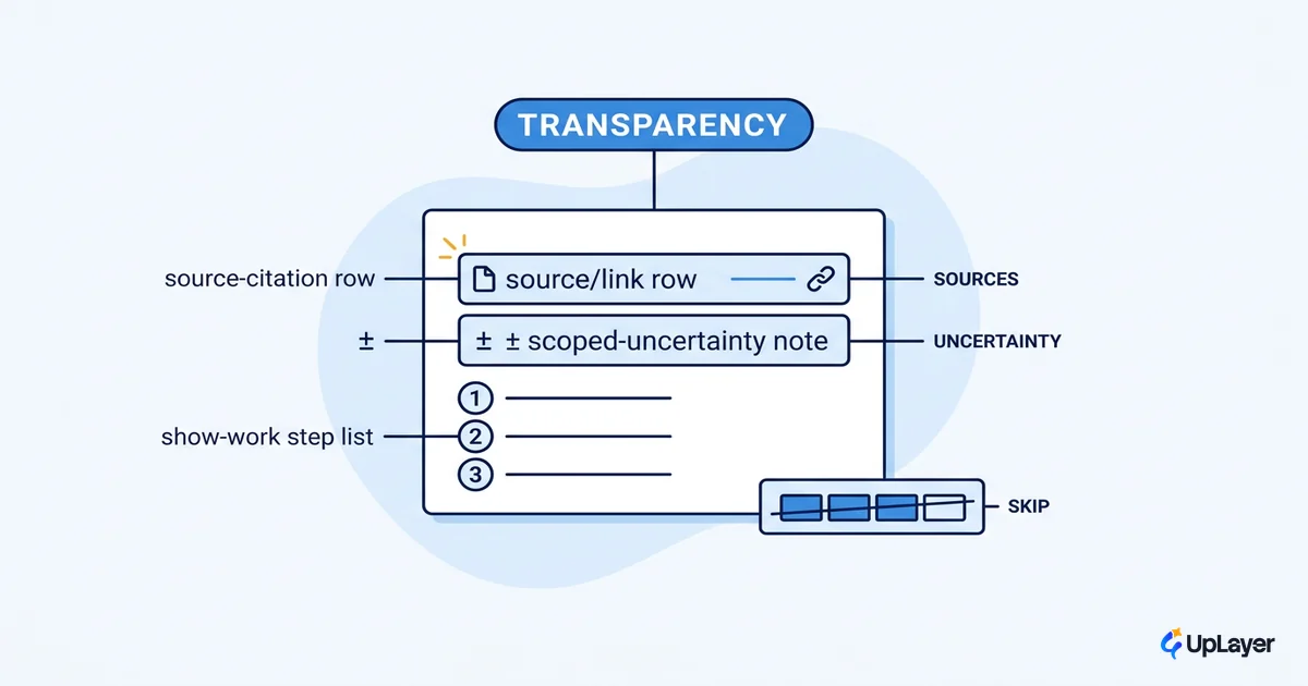
The signals that move acceptance are the ones that show the model's basis and give the user a way out. This is where AI transparency patterns stop being a compliance exercise and start being an adoption lever.
The numbers are clear. In Salesforce research, 44% of consumers are more likely to use an AI agent if its logic is clearly explained, 45% are more likely if there is a clear escalation path to a human, and nearly 75% want to know when they are talking to AI at all. Explained logic and a visible exit are not nice-to-haves. They are the difference between a feature people use and one they route around.
Nearly 75% of consumers want to know if they're communicating with an AI agent, and 45% are more likely to use one if there's a clear escalation path. Source: Salesforce, State of the AI Connected Customer.
Disclaimers count too, but only when they are read. The pattern that works is plain language, placed near the input where attention sits, and paired with a specific action. "AI can make mistakes, double-check responses" beats "for reference only" because it tells the user what to do. A disclaimer buried in a footer or hidden behind a help icon is the same as no disclaimer.
Designing for AI uncertainty without false precision
Here is the part the listicles skip: sometimes the right move is less signal, not more. Designing for ai uncertainty means matching the amount of disclosure to the stakes, and refusing to fake certainty.
Google's People + AI Guidebook advises that you account for situational stakes: prompt the user to verify in low-confidence, high-stakes moments, and reveal the rationale behind high-confidence predictions, but do not bury every routine output under warnings. Two failure modes do real damage. A single high-confidence percentage on one answer reads as a guarantee. And step-by-step "reasoning" walkthroughs often look transparent while being rationalizations generated after the fact, so they manufacture trust the model has not earned.
A simple rule keeps you honest. Choose the signal by stakes times confidence, not by what looks impressive in a demo.
signal_for(output):
  if stakes == HIGH and confidence == LOW:
    require_verification + show_sources + offer_human_handoff
  elif stakes == HIGH and confidence == HIGH:
    show_reasoning_basis + citations    # earn the trust, show the work
  elif stakes == LOW:
    minimal_signal                      # don't tax routine actions
  # never: single bold % on one answer implying certainty
WARNING
A confidence percentage on a single high-probability answer is false precision. It invites the blind reliance you are trying to prevent. When in doubt, use High/Medium/Low or no number at all.
This is also where deciding what not to build pays off, and where deciding an AI feature is worth shipping and designing its failure case first do the heavy lifting. If you cannot produce a faithful confidence estimate or a real explanation, do not fake one. Ship the citation and the undo instead, and your users will build trust in AI features at a pace that holds.
Tie every trust signal to a metric (ai feature adoption)
A trust signal that you cannot measure is a guess. The discipline is to define the calibration target as a number before you design the component, then instrument it. This is the same move behind every AI UX pattern that drives feature adoption: a pattern earns its place by moving a metric, or it gets cut.
Pick the metric the feature already touches. For a copilot, it is adoption and repeat use. For an agent, it is escalation rate and one-and-done abandons. Then state the target and watch the delta.
TIP
Instrument three things per AI feature: adoption (did they use it), retention of use (did they come back), and the escape hatch (how often they undo or escalate). A rising escape-hatch rate after you add a confidence signal usually means the signal is honest and working, not that the feature is failing.
As a Concept Demo, picture a support copilot that tiers its answers: High-confidence replies show sources inline, Low-confidence ones open with "I'm not sure, here's what I found" and a one-click handoff. Projected to lift sustained adoption because users stop getting burned by silent wrong answers, and projected to cut one-and-done abandons because the low-confidence cases route to a human before they sour the relationship. Designed to move the metric, not the demo.
Done well, ai trust signals design is not about looking trustworthy. It is about being legible: showing how sure the model is, clearly enough that users rely on it when they should and check it when they should, and then proving that calibration moved a number you already track. Build that, and the trust takes care of itself.
TIP
Want to know which AI feature in your product is worth this kind of trust work, and what to skip? How the AX Audit works.