Designing for AI uncertainty without losing trust
Designing for AI uncertainty is a UX decision: how to show confidence, hedge gracefully, and recover from wrong answers so users keep trusting the feature.
 Shahriar P. ShuvoAI Product & UX Design10 min read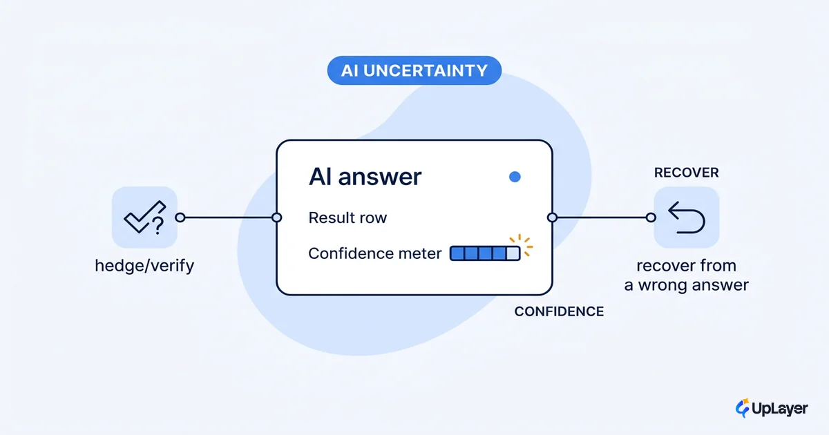
Your model will be wrong sometimes. That is not a bug you can fully engineer away, and pretending otherwise is how trust dies. The interesting question is not "how do we stop the AI from being wrong" but "what does the user see when it is."
That is a design problem. Designing for AI uncertainty means deciding, before you ship, how the interface behaves when the model is unsure, when it is confidently wrong, and when it has no good answer at all. Most teams treat this as an afterthought and bolt an error toast onto the end. Then a sales engineer pastes a hallucinated number into a customer deck, trust collapses, and the feature gets quietly switched off.
Whether a wrong answer costs you a user is a decision you make at the UX layer, not a model metric you chase after launch. The cheaper move is to make the gap between "the model is confident" and "the answer is correct" legible on the screen, then tie the feature to a metric you already track so you can see whether the design is holding retention. This piece walks through how to surface confidence, hedge gracefully, and recover from wrong answers so people keep using the feature instead of abandoning it.
Uncertainty is a design problem, not a model problem
The fastest way to lose user trust is to render a probabilistic guess in the same visual language you use for a verified fact. A model output and a database lookup are not the same kind of thing, and an interface that presents them identically is lying by omission.
This is the core reframe. You can spend six months shaving two points off your hallucination rate, or you can spend two weeks designing the interface so a wrong answer is survivable. The second path moves the metric your buyer actually tracks, because adoption and retention are governed by how a feature behaves on its worst day, not its average one. Current generative models are, as Nielsen Norman Group puts it, prone to including erroneous information in their results, and when users cannot see how an answer was produced it is harder for them to catch or correct it. The quality of an AI feature is measured not by how often it succeeds but by how gracefully it fails.
For a founder or Head of Product, the math is plain. A feature that is right 92% of the time and visibly honest about the other 8% gets used. A feature that is right 97% of the time and presents every answer with the same flat confidence gets one bad screenshot in a customer Slack and dies. The model improved; the product still failed. That asymmetry is the whole reason designing for AI uncertainty belongs in the design review, not the model evaluation.
WARNING
Trust is asymmetric. A feature can be right 90 times, and the one confident, wrong answer is the one a user remembers and forwards to their team. Design for the worst answer the user will see, not the average one.
How to show AI confidence to users without faking precision
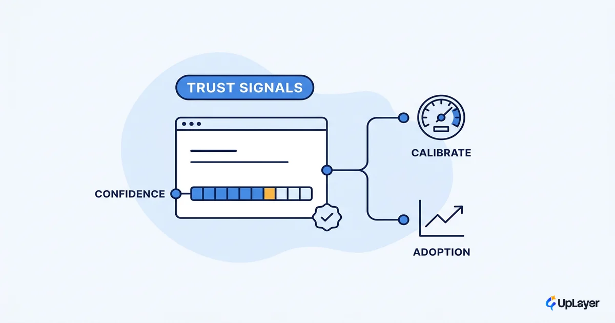
Confidence is a design signal, not a raw number you paste on the screen. The goal is calibrated trust: the user should rely on the system when it is likely right and double-check it when it is not. A lone "94% confident" label does the opposite of that. It manufactures false precision around a number the model cannot actually justify, and it invites the user to trust the wrong answers as much as the right ones.
Google's People + AI Guidebook frames the job as helping users calibrate their trust by articulating data sources and accounting for situational stakes. The practical translation is that you show more explanation, and more friction, exactly where being wrong is expensive, and you stay quiet where it is cheap. Good ai ux best practices treat the confidence display as a decision aid, not decoration.
A few patterns hold up across products:
- Categorical bands over raw percentages. "High / medium / low" or "verified / suggested / uncertain" communicates calibration without implying precision the model does not have.
- Show the source, not just the score. Grounding an answer in a citation the user can open in one click turns blind trust into checkable trust. The confidence and trust signals you attach to an answer matter more than any single number.
- Reserve numeric scores for when options compete. A numeric score earns its place when the user is choosing between ranked results, because the relative order is the information. As a standalone badge on a single answer, it is noise dressed as rigor.
- Hedge the copy, not just the chrome. "Here is a draft you should review" sets a different expectation than "Here is your answer," and it costs you nothing but a verb.
The same honesty applies while the model is still working. A response that takes a few seconds reads as broken if the screen sits blank, so the loading and feedback states an AI feature shows carry part of the calibration job too, naming what is happening rather than hiding the wait behind a generic spinner.
The test for any confidence pattern is simple. If the label would change what the user does next, show it. If it would not, it is decoration that dilutes the signals that matter.
How do you handle wrong AI answers in the UI
Assume the answer will sometimes be wrong, then design the screen so the user can catch it, correct it, and move on without losing work. Recovery is a first-class design surface, not an error state you add at the end.
This is where most AI features are thin. They are built for the happy path and treat failure as an exception, when failure is a guaranteed and frequent state. Google's guidance on graceful failure is built around a single question: does your product let users move forward after a failure? The interface qualities that answer "yes" are the unglamorous ones. Editability, undo, honest error messages, and a clear escape hatch back to manual control. A user who can fix a wrong answer in two seconds stays. A user who has to start over, or who cannot tell the answer was wrong, leaves.
The examples worth copying are about reversibility. GitHub Copilot proposes inline suggestions the developer can accept or reject every suggestion one keystroke at a time, so no AI change lands without a human keeping or discarding it. The shared principle: the more severe and less reversible an action, the more confirmation it should require before it runs.
A useful way to decide how much friction to add is to sort every AI action by its failure mode.
| Failure mode | Design response | Trust impact |
|---|---|---|
| Confidently wrong fact (hallucination) | Inline citations the user can verify in one click; grounding shown by default | Turns blind trust into checkable trust; a bad answer points to its bad source |
| Low or ambiguous intent match | Surface 2 to 4 scoped interpretations; never silently guess | User stays in control; no invisible wrong turn to discover later |
| Model is uncertain but must answer | Hedged copy plus a categorical confidence band; numeric score only when options compete | Calibrated trust; avoids the false-precision trap of a lone high percentage |
| High-stakes, irreversible action (send, delete, deploy, charge) | Explicit human confirmation before execution | Prevents catastrophic, unrecoverable errors that kill adoption outright |
| Reversible mistake already shown in the UI | One-click undo, edit-in-place, and a rollback after the fact | Mistakes become cheap; users stay because recovery costs seconds |
| No good answer exists | Honest "I don't have a reliable answer" with a fallback to manual or human | Refusal beats fabrication; an honest "no" protects long-term trust |
Variance is what makes this list necessary in the first place. A probabilistic system returns a different answer to the same prompt, which is why generative AI product design treats the wrong-answer path as a core surface rather than an edge case. The bottom row is the one teams skip and the one that matters most. Making "I don't know" an acceptable answer, with a clean handoff to a scripted response or a person, beats a fabricated answer every time. A model that refuses when it should refuse is more trustworthy than one that always produces something. The deeper treatment of refusal and recovery lives in our guide to designing empty and error states that recover.
Match human-in-the-loop friction to the cost of being wrong
Scale the friction to the consequence. Cheap, reversible actions should be near-frictionless; expensive, irreversible ones should require a person to confirm. Treating every AI action with the same weight either buries the dangerous ones in noise or smothers the harmless ones in confirmation dialogs.
Human-in-the-loop design means the AI proposes and a person disposes on anything that matters. Sending the email, closing the ticket, changing the record. The model does the slow, repetitive 80%, and the human keeps authority over the consequential 20%. That single pattern removes most of the embarrassment risk while keeping nearly all of the speed. Microsoft Research's guidelines for human-AI interaction land in the same place: make clear what the system can do, scope its services to the context, and support efficient correction and dismissal so the user can always step back in.
The decision rule is a two-axis sort, and you can write it as a short ladder around your model call.
For each AI action, score two things:
  severity      = how bad is a wrong result?      (cosmetic ... catastrophic)
  reversibility = how cheaply can the user undo?   (instant ... permanent)

Then pick the friction:
  low severity   + high reversibility -> auto-apply, offer undo
  low severity   + low reversibility  -> apply, require explicit dismiss/keep
  high severity  + high reversibility -> preview + one-click confirm
  high severity  + low reversibility  -> human-in-the-loop confirm, log it, no silent execution
Most "AI feels risky" complaints trace back to a single miss: a high-severity, low-reversibility action was allowed to run without a human gate. Fix that one quadrant and the feature stops generating the incidents that erode trust. This is the heart of good human ai interaction design. Not more dialogs everywhere, but the right friction in the one place it matters.
AI design principles that keep uncertainty legible
The patterns above reduce to a small set of principles you can hold every AI screen against. They are deliberately boring, because the boring decisions are the ones that hold up on a bad day. They also belong inside the wider craft of UI and UX design for AI products, where uncertainty is one input among several the interface has to make legible.
- Render uncertainty in a different visual language than fact. If the user cannot tell a guess from a lookup at a glance, the ai interface design has already failed.
- Ground answers in sources the user can check. Citations and grounding are not a transparency nicety; they are the recovery path for a wrong fact. Our transparency patterns cover how to show the seams without burying the answer.
- Make every mistake cheap to undo. Reversibility is worth more than accuracy points, because it changes the cost of being wrong from "lost user" to "lost two seconds."
- Let the system say no. An honest refusal protects trust that a confident fabrication spends.
- Add friction only where the cost of wrong is high. Calibrated friction is the difference between a feature that feels safe and one that feels annoying.
NOTE
None of these require a better model. They are interface decisions, which means a small team can ship them in a sprint and measure the retention effect before committing to a six-month accuracy program.
How do you measure whether the design is working?
Watch the same retention and adoption numbers you already report. The signal is in the second session, not the first. Users who hit a wrong answer and could recover come back; users who hit a wrong answer and lost work, or never noticed it was wrong, churn quietly. Instrument the recovery surfaces (undo taps, citation clicks, refusals followed by a manual completion) and you can see uncertainty design move the metric instead of guessing that it does.
Designing for AI uncertainty is a retention lever, not a polish task
The model will be wrong sometimes. Whether that costs you a user is a design decision you make before you ship, not a model metric you chase after. Show confidence only where it changes a decision, ground answers in sources the user can check, scale human-in-the-loop friction to the cost of being wrong, and make every mistake cheap to undo. Do that, and a wrong answer becomes a survivable moment instead of a trust-ending one.
Most teams discover these gaps in production, after the feature is already losing users. The cheaper path is to find them before you build, which is exactly what designing for AI uncertainty is: deciding the worst-day behavior while it is still a sketch. Treat the next AI feature as a retention bet, map where a wrong answer would cost you trust, and design the recovery before you write the production code.
TIP
Our AX Audit maps where AI will move a metric you already track, includes a reliability and risk map for the feature, and ships a working Concept Demo of the top opportunity in 14 days. The 3X Guarantee covers it: we find AI worth 3x the fee, or the audit is free. How the AX Audit works.