UI UX design for AI products that retain users
UI UX design for AI products is where most AI features live or die. The interface shifts that turn a working model into a feature people keep using daily.
 Sohanur RahmanAI Product & UX Design8 min read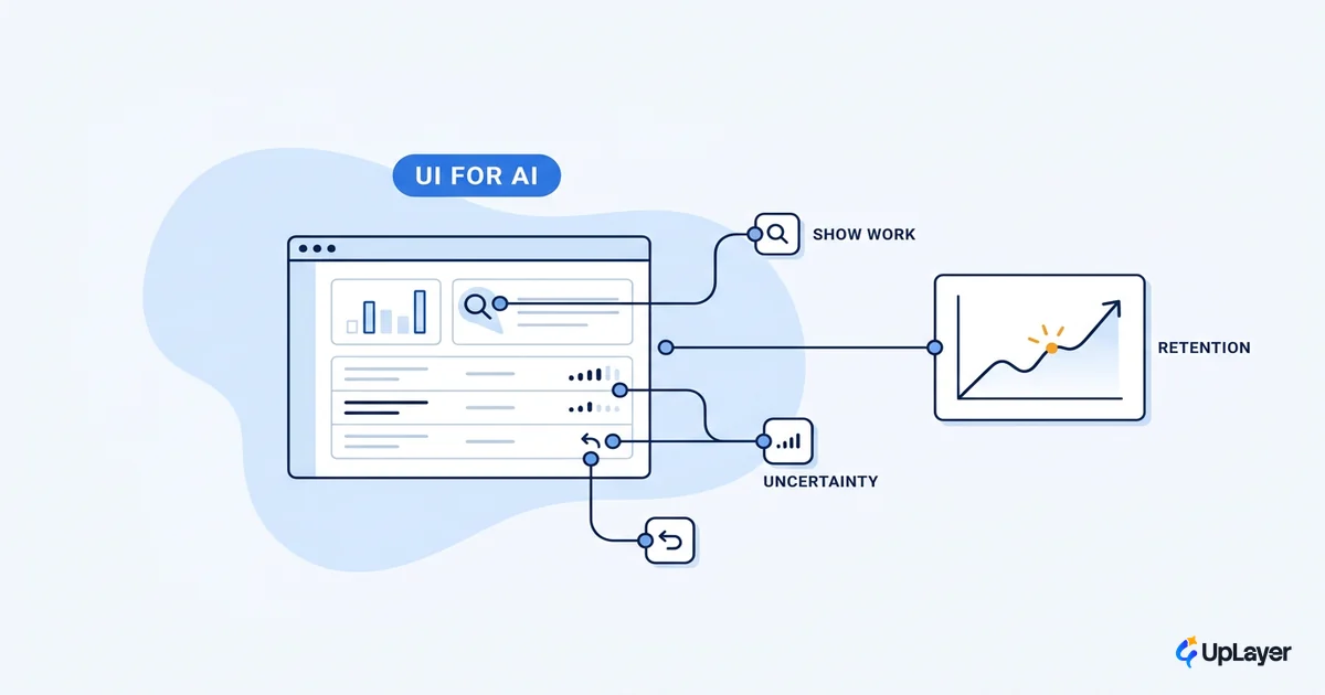
The model works in the demo. The team ships. The usage chart stays flat. This is the most common shape of an AI feature failing, and the cause is almost never accuracy. The feature dies at the interface: people cannot find it, do not trust its output, or cannot recover when it gets something wrong. UI UX design for AI products is the layer that decides which of those happens. Get it right and a probabilistic system feels dependable. Get it wrong and a perfectly good model becomes a button nobody presses.
We treat that layer as a product decision, not a coat of paint. Every shift below is tied to a metric you already track, because an AI feature that does not move a number is theater however good the interaction feels. If you want the pattern-level field guide that sits underneath this piece, start with AI UX patterns that drive feature adoption; this article is the layer above it, about the interface shifts that separate AI products people keep from ones they try once and drop.
Why AI products fail at the interface, not the model
AI is no longer a differentiator on its own. By Stanford's count, 78% of organizations reported using AI in 2024, up from 55% the year before. When everyone has a model, the model is table stakes and the experience is the product. That is the first thing UI UX design for AI products has to internalize: presence of AI proves nothing, and users have stopped being impressed by it.
The value of these tools is real when people can actually reach it. NN/g found that generative AI raised business-user throughput by 66% in controlled studies on realistic tasks. That number is a ceiling, not a floor. It only shows up in your product if the interface lets a non-expert get there without writing the perfect prompt or guessing what the feature can do. Most teams chase the ceiling by improving the model. The cheaper win is usually upstream, at the surface where the user meets the system.
The loss is rarely in the model's answer. It is in whether the user ever asked the right question, trusted the result, or knew what to do next.
Pick the metric before you touch the interface. Activation if the feature is new, repeat use if it should become a habit, task completion if it replaces manual work. The job of the UI is to move that one number, and you cannot tell whether a design choice helped if you never named the number it was supposed to move.
What actually changes in UI/UX for AI products
Most design intuition was built for deterministic software, where the same input always returns the same output and a wrong result is a bug. AI breaks that contract. The same input can return different output, the output is sometimes wrong by design, and "wrong" is an expected state rather than a defect. Good AI interface design starts by accepting that and designing for the variance instead of pretending it away.
The input model changes first. In traditional software the user issues commands. With AI, as Jakob Nielsen put it, the interaction becomes intent-based outcome specification: the user states the outcome they want and the system decides how to get there. That sounds freeing and is often the opposite, because a blank box gives no hint of what the system can do or how to ask. So what changes in UI/UX for AI products is not one thing but the whole chain from input to trust:
| Layer | Deterministic software | AI products |
|---|---|---|
| Input | User issues exact commands | User specifies an outcome, system infers the steps |
| Output | Fixed and repeatable | Variable, sometimes wrong, needs interpretation |
| Feedback | Instant and literal | Needs framing so users can judge the result |
| Error model | A wrong result is a bug to fix | A wrong result is expected; recovery is the design |
| Trust | Assumed once it works | Earned every session, lost in one bad answer |
The practical consequence: in deterministic design you optimize the happy path. In AI products you design the failure state first, because the failure state is not an edge case. It is part of normal operation, and how gracefully it recovers is what users remember.
The trust gap you are actually designing for
There is a gap between how the people building AI feel about it and how the people using it feel, and that gap is the real design problem. Pew Research found that 47% of AI experts are more excited than concerned, against just 11% of the public; the public is more likely to expect AI to harm them (43%) than benefit them (24%). Your team is in the first group. Your users are in the second. Good ai ux design closes that distance at the moment of use rather than assuming it away.
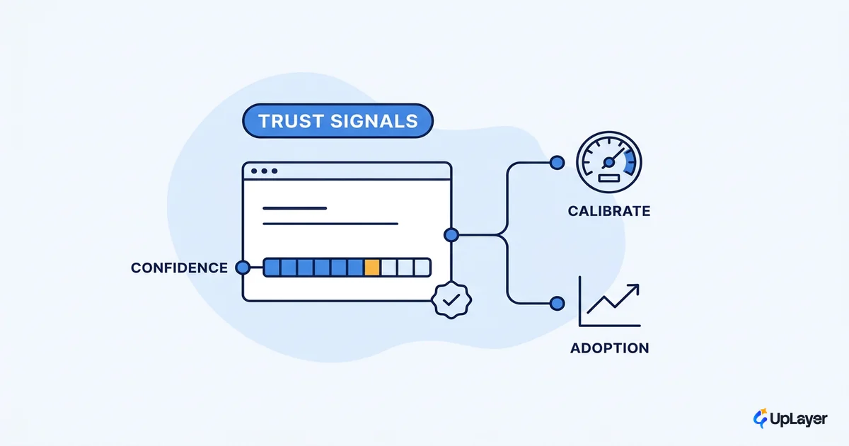
Closing it is concrete work, not a vibe. Show the work so the output is inspectable. Make uncertainty legible instead of hiding it behind false confidence. Make correction cheap so a wrong answer costs a click, not a restart. None of this is about making the AI look smarter. It is about making it honest enough to be trusted twice. For the deeper treatment of that specific problem, see designing for AI uncertainty without losing trust; here the point is narrower: trust is a metric input, and the interface is where you earn it or lose it.
IMPORTANT
Confidence theater is the fastest way to break trust. A UI that presents every answer as equally certain trains users to distrust all of them once one is wrong. Show uncertainty where it exists.
The AI UX patterns that earn their place (and the ones that do not)
There is no shortage of AI ux patterns to copy. The question is never whether a pattern is clever; it is whether it moves the metric you named, and whether it is honest. A pattern that exists to look impressive is a cost, not a feature. Below is the short list we reach for, each mapped to the number it actually moves.
| Pattern | Metric it moves | Use it when | Skip it when |
|---|---|---|---|
| Streaming / progressive output | Perceived speed, completion | Latency is unavoidable | The result is short or instant |
| Citations and sourcing | Trust, repeat use | Output makes claims users must verify | The task is subjective or creative |
| Confidence and uncertainty signals | Trust, error recovery | The model can be confidently wrong | You would be faking the confidence number |
| One-click correction and undo | Task completion, retention | Output is a draft the user refines | The action is irreversible without review |
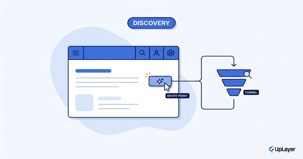
| Scoped entry points | Activation, discoverability | Users do not know what to ask | A full open-ended surface is genuinely needed |
The most common mistake is the bare chat box bolted onto a dashboard. A blank prompt hides what the system can do and pushes the work of figuring it out onto the user. NN/g's chatbot research is blunt about this: set expectations and always give users an escape hatch to a known path. A scoped entry point, a few suggested actions, or a surface generated in real time and tailored to each user's context will almost always beat an empty field for a feature you want people to actually adopt.
WARNING
Do not ship a chat box because it is the easy thing to build. Most users will not type a good prompt, and a blank box gives them nothing to work with. Default to scoped, supportive surfaces and reserve open-ended chat for the cases that truly need it.
Use a single rule to decide whether a pattern ships. If it does not survive it, cut it.
SHIP a pattern only if ALL are true:
  1. It maps to a metric you already track (activation, repeat use, completion, trust).
  2. It tells the truth about the AI (no faked confidence, no hidden uncertainty).
  3. Removing it measurably hurts that metric in a test.

Otherwise: cut it. A pattern that fails any line is theater.
How do you do UI UX design for AI products in practice
The loop is small and repeatable. The discipline is doing it in this order, because most teams design the happy path first and bolt on trust and recovery later, which is backwards.
- Name the metric first. One number the feature should move. No metric, no design.
- Design the smallest supportive surface. The least interface that lets a user reach the outcome. Scoped beats open-ended for adoption.
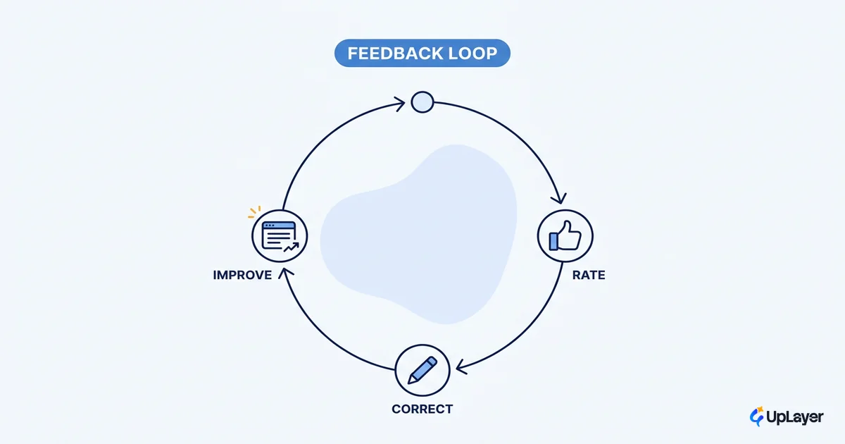
- Design the failure state before the happy path. Wrong, slow, and empty results are normal operation. Make recovery a click.
- Instrument trust signals. Sourcing, uncertainty, and easy correction are not decoration; they are what earns the second session.
- Measure repeat use, not first use. A feature that is tried once and dropped moved nothing. Retention is the verdict.
This is the same discipline that runs through how to design AI features users actually adopt, applied to the interface specifically. Treat AI as a supportive layer on top of the engine your users already rely on. Good ai product design does not replace the product's UI with a model. It adds a surface that helps, names the metric it helps, and proves the lift.
The AI products people keep are not the ones with the best model. They are the ones whose UI made a probabilistic system feel dependable, where a wrong answer was cheap to fix and a right one was easy to trust. That is the whole job of UI UX design for AI products, and it is decided at the interface long before the model gets the credit or the blame.
TIP
Want to know which AI feature is worth the design investment, and prove it on a metric you already track? How the AX Audit works.