AI interface design for trustworthy features
AI interface design that makes model output readable, correctable, and worth trusting at a glance, tied to a metric your team already tracks.
 Anamoul RoufAI Product & UX Design7 min read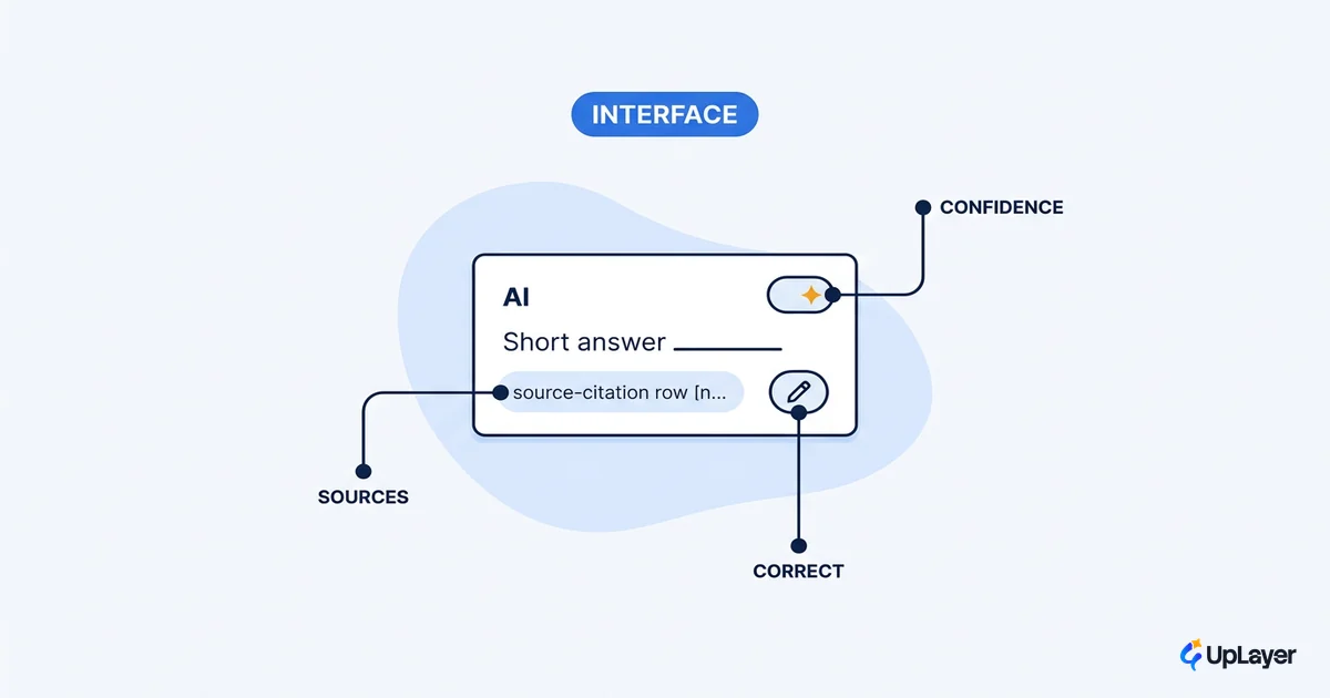
Most AI features do not fail at the model. They fail at the interface. The model returns a usable answer, and then the screen presents it in a way nobody trusts, so nobody acts on it. That is the real job of ai interface design: take a probabilistic engine and make its output readable, correctable, and worth trusting at a glance.
This matters because trust is not a vibe. A feature people do not trust is a feature people do not use, and an unused feature moves no metric. So every interface decision here ties back to a number you already track, the same discipline we bring to AI UX design more broadly: adoption, task completion, the rate at which users accept a suggestion instead of dismissing it.
Below are the interface decisions that decide whether your AI feature earns its place, and the ones worth skipping.
What good AI interface design actually means
A good AI interface makes uncertain, probabilistic output legible and steerable, so a user can judge it in seconds and correct it without friction. That is the whole standard.
It helps to name what changed. Classic UX assumes a deterministic system: the same input gives the same output, so you design one happy path. AI breaks that assumption. The same prompt can return a strong answer, a mediocre one, or a confidently wrong one, so you are designing for a distribution of outputs rather than a single result. That shift reshapes the whole craft, which is why UI and UX design for AI products starts from probabilistic output instead of the deterministic assumptions classic UX was built on. The field is even moving toward interfaces that are dynamically generated in real time to fit each user, which raises the stakes on the fundamentals: a personalized screen that confidently shows the wrong thing is worse than a static one that shows the right thing.
The practical consequence is that an AI interface has three jobs the model cannot do for you. Set expectations before the output appears. Present the output so its reliability is visible. Give the user a fast path to correct or recover when it is wrong.
Designing for AI uncertainty without faking confidence
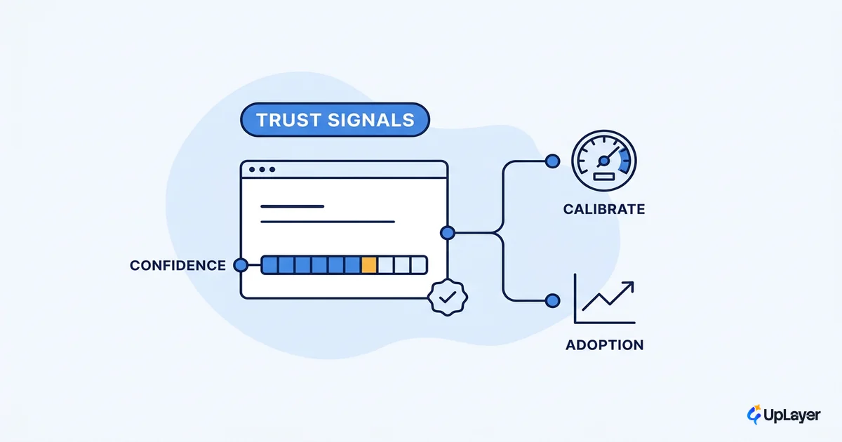
The interface should show how sure the system is, not pretend it is always sure. Designing for AI uncertainty means the screen carries the honesty the model lacks.
Google's research team puts it plainly: because AI is based on statistics and probability, the user should not trust the system completely, and the interface should help them calibrate their trust so they know when to rely on a prediction and when to apply their own judgement. That is a design responsibility, not a model setting. It shows up as confidence cues, hedged language when the system is unsure, visible sources, and explicit "you may want to check this" states for low-confidence output.
The failure mode is fake confidence: a clean, assertive answer with no signal that it might be wrong. It demos beautifully and erodes trust the first time a user catches it lying. We cover the full playbook in designing for AI uncertainty, but the interface rule is simple. Match the visual confidence of the output to the actual confidence of the system.
AI UX patterns that make output readable and correctable
The AI UX patterns that earn their place share one trait: each one has a job tied to a number, not a look tied to a trend. Readability and correctability are the two outcomes worth designing for, because they convert a raw answer into something a user will act on.
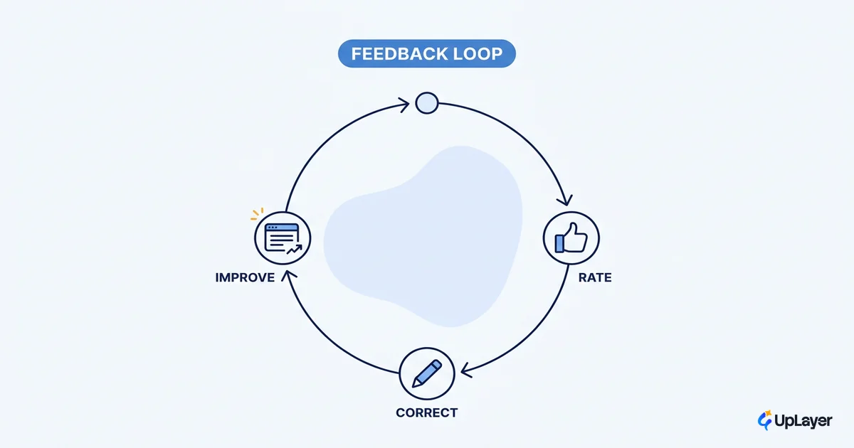
Control is part of trust. When users have the right level of control over an AI system, they are more likely to trust it, and their corrections feed back into a better model over time. So the interface should make correction the easy path, not a buried menu. The table below separates the pattern, the metric it moves, and the cosmetic version that moves nothing.
| Pattern | What it does | Metric it moves | The theater version |
|---|---|---|---|
| Confidence and provenance cues | Shows how sure the system is and where the answer came from | Suggestion acceptance rate | A decorative "AI" badge with no signal |
| Inline correction and editing | Lets users fix output in place, not start over | Task completion, correction rate | A thumbs up or down that changes nothing |
| Explicit uncertainty states | Flags low-confidence output for review | Trust, reduced silent errors | A spinner that hides a weak answer |
| Steerable output | Lets users adjust scope, tone, or length before accepting | Repeat use, retention | One fixed answer, take it or leave it |
These are close cousins of the transparency patterns users can read and the broader set of AI UX patterns that drive feature adoption. The common thread: every pattern here is correctable and legible, and you can point at the metric it is supposed to move.
What makes a good AI interface, and how do you design for AI output
A good AI interface does three things in order: it sets expectations before the output, it presents the output with its reliability visible, and it gives a path forward when the output is wrong. That sequence is also how you design for AI output in practice.
The third step is the one teams skip. Google's guidance on errors is direct: focus on what users can do after the system fails, because providing paths forward from failure keeps the product useful instead of dead-ending the user. Microsoft's research backs the same discipline with 18 research-backed guidelines for human-AI interaction, organized around initial use, ongoing use, when the system is wrong, and behavior over time. You do not need all 18 for one feature. You need the ones that fit the moment your output appears.
Here is the decision rule we apply to any AI surface before it ships.
For each AI output on screen, the interface must answer:

1. EXPECTATION   What is this feature for, and what can it not do?
                 (state scope before the first output)
2. RELIABILITY   How sure is the system, and where did this come from?
                 (confidence cue + provenance, visible without a click)
3. CORRECTION    How does the user fix or steer this in place?
                 (inline edit, regenerate, adjust scope)
4. RECOVERY      What happens when it is wrong or empty?
                 (a next action, not a dead end)

If any answer is "nothing," that is the gap to design, not ship around.
WARNING
The most expensive interface bug in AI is confident-wrong output. An answer that looks certain and is false costs more trust than three answers that admit uncertainty. Design the failure case as a first-class screen, not an afterthought.
The interface decisions worth skipping
Not every interface pattern earns its pixels, and plenty of trendy ai design patterns add a layer of AI signaling without changing what a user can do. The anti-hype move is to say no to them.
Skip the decorative AI badge that carries no confidence or provenance signal. Skip the fake precision of a confidence percentage you cannot actually compute. Skip a chat box where a single button or a structured form would be faster and more reliable. Chat is a powerful surface, but it is not a default, and forcing every AI feature through a conversation is theater that adds friction. The test is the same one we use everywhere: if removing the pattern makes the feature easier to trust and faster to use, remove it.
How AI interface design ties back to ROI
Strong ai interface design is not a polish layer. It is the layer where a working model either becomes a feature people adopt or a feature people ignore. The interface is where trust is won or lost, and trust is what converts model capability into a metric you already track. This is the practical core of AI UX: the experience around the model decides adoption far more than the model's raw accuracy does.
So the loop closes on measurement. Before you ship, decide which number the feature should move, then design the interface to remove the trust gaps between the model's answer and the user acting on it. If you want the discipline behind that, start with how to measure the ROI of an AI feature against a metric you already track, then bring the interface in to protect it.
NOTE
The interface is the cheapest place to fix an AI feature and the most common place teams forget to look. A model swap is expensive. A clearer correction affordance often is not.
Treat the screen as the part of the system that has to earn trust on the model's behalf, and ai interface design stops being a finishing step and becomes the thing that decides whether the feature pays off at all. The teams that get this right are not the ones with the best model. They are the ones whose output a user can read, doubt, and correct without leaving the task.
TIP
Our AX Audit finds where AI will move a metric you already track, maps the reliability and interface risks of the feature, and ships a working Concept Demo of the top opportunity in 14 days. The 3X Guarantee covers it: we find AI worth 3x the fee, or the audit is free. How the AX Audit works.