AI UX design for products people keep using
AI UX design is the craft of shipping a supportive AI layer users adopt and keep. Design for retention, not novelty, and tie it to a real metric.
 Shahriar P. ShuvoAI Product & UX Design11 min read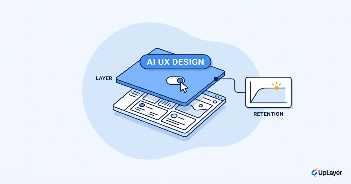
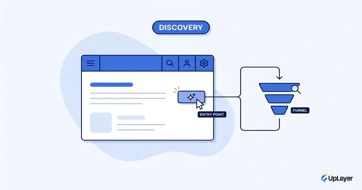
Most AI features are designed to be seen, not used. The team adds a sparkle icon, ships a chat box, and watches the launch-week numbers spike. Three weeks later the metric that was supposed to move is flat, and the feature sits in the product like furniture nobody touches. That gap between novelty and adoption is exactly what AI UX design is supposed to close.
AI UX design is the craft of designing a product so a supportive AI layer earns its place on the screen and keeps earning it. Not the AI that demos well. The AI people open on a Tuesday because it makes their work faster, and open again the Tuesday after. This piece covers what the discipline actually is, how AI changes the way you design UX, the patterns that move a metric instead of the eye, and how to know your work is holding up after the novelty wears off.
What is AI UX design
It is the practice of designing the experience around a probabilistic feature so users adopt it, trust it, and return to it. The product gets more usable with the AI on top. The AI itself stays in the background doing a job, not in the foreground asking for applause.
This is a real shift in the medium, not a new coat of paint. Nielsen Norman Group calls conversational and intent-based AI the first genuinely new interaction paradigm in 60 years, moving from the user issuing commands to the user stating an outcome and the system figuring out how to deliver it. That sounds liberating until you remember the same article notes current AI is "prone to including erroneous information in its results." So the design problem is not how to show off the model. It is how to make a powerful, occasionally wrong assistant feel dependable enough that a busy person keeps using it.
If you want the short definition of the surface this sits on, we keep a separate explainer on what AI UX really means for a product. The one-line version: AI UX is the design of the layer, not the model underneath it.
How does AI change the way you design UX
Traditional UX assumes a deterministic system. The same input produces the same output, every time, so you design one happy path and a handful of edge cases. AI breaks that assumption. The same prompt can return a great answer, a mediocre one, or a confidently wrong one, so you are designing for a distribution of outputs rather than a single result.
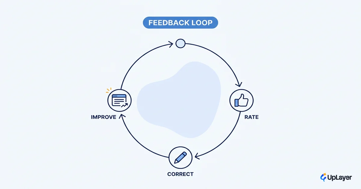
That changes three things in practice. You design the failure case as a first-class screen, not an afterthought. You give the user a way to steer and correct, because the system will sometimes get it wrong. And you set expectations before the output appears, so a hedge does not read as a bug.
It also opens a direction the field is still mapping. NNG describes generative UI as an interface dynamically generated in real time to fit each user's context, shifting from one interface for everyone toward tailor-made experiences. That future is promising, but it raises the stakes on the fundamentals below. A personalized interface that confidently shows the wrong thing is worse than a static one that shows the right thing.
AI UX patterns that move a metric, not the eye
Good ai ux patterns are not chosen because they look modern. They are chosen because each one has a job tied to a number the team already tracks. Here is the difference between a pattern that moves a metric and the cosmetic version of the same idea.
| Pattern | Metric it should move | The cosmetic trap |
|---|---|---|
| Inline suggestion at the point of work | Activation, time-to-value | A floating "Ask AI" button users never click |
| Draft-then-edit (AI writes, human owns) | Task completion rate | A blank chat box that demands a perfect prompt |
| Confidence and source on every answer | Trust, repeat use | A confident answer with no way to verify it |
| Recovery from a wrong answer | Retention | A dead end where the user has to start over |
| Progressive disclosure of AI controls | Feature adoption | Every knob exposed at once, so nobody touches any |
The pattern is never the point. The job it does for the user is the point, and the metric is how you check the job got done. We go deeper on this in the cluster post on AI UX patterns that drive feature adoption, and on the catalog of AI design patterns mapped to the metric each one moves.
AI interface design for the failure case
Most teams design ai interface design around the moment the AI is right. The moment that decides whether people keep using it is the moment the AI is wrong. If a wrong answer is cheap to spot and cheap to fix, trust survives. If it is invisible or expensive to undo, trust does not come back.
There is a measurable trust gap to design against. Pew Research found that while 47% of AI experts are more excited than concerned about AI in daily life, only 11% of the U.S. public feel the same way, and a majority of the public are more concerned than excited. Your users are closer to that public than to the experts who built the model. They arrive skeptical, and a single confidently wrong answer with no recovery path confirms the skepticism.
IMPORTANT
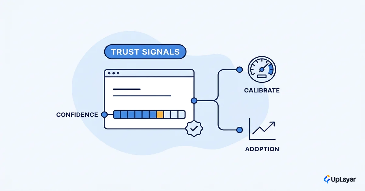
Design the wrong-answer path before the right-answer path. Show confidence, cite the source, and make correction one click away. The feature people trust is the one that admits when it is unsure.
The mechanics of this, surfacing confidence, hedging gracefully, and recovering without a dead end, are a full topic on their own. We cover them in designing for AI uncertainty and in the specifics of AI confidence and trust signals.
AI UX best practices that actually hold up
Most ai ux best practices posts hand you a checklist of nice words: transparency, control, feedback. The words are right, but a checklist is not a design. The practices that hold up are the ones you can check against a metric, not against your taste.
Here is the short framework we use, written as a config you can keep next to the work.
# ai-ux-design check: run before you ship
feature:
  earns_its_place: true        # tied to a metric you already track
  metric: "activation"         # one number, named up front
design:
  shows_confidence: true       # never a bare answer
  cites_source: true           # the user can verify
  recovery_path: true          # one click out of a wrong answer
  expectation_set: true        # hedge reads as honesty, not a bug
guardrails:
  human_in_the_loop: true      # human owns the high-stakes decision
  fails_safe: true             # a model swap never takes the product down
proof:
  baseline_captured: true      # you measured before, so you can measure the delta
A note on the gains people promise. NNG's productivity work found programming saw a 126% improvement with AI support and projects that UX work can roughly double the throughput on the tasks that suit it, while warning that not all UX work gains equally. The same honesty belongs in your product. Some user tasks get dramatically faster with AI on top, and some do not. Designing AI into the second kind is how you ship a feature that demos well and moves nothing.
WARNING
Novelty is not a metric. If the only thing your AI feature reliably moves is launch-week curiosity, it has not earned its place. Define the number first, then design the layer.
For the longer version of these, with examples, see our guide to AI UX best practices for product teams.
Designing for retention, not novelty
Novelty decays on a schedule. Curiosity gets people to try the feature once, and that first spike flatters everyone in the launch retro. Retention is the harder, truer signal: the same users coming back because the feature reliably saves them effort. The whole point of the discipline is to optimize for the second curve, not the first.
That changes what you build. You stop adding AI to the parts of the product that are easy to demo and start adding it where a real metric is stuck. You design the supportive AI layer to sit above the core engine, so reliability guardrails and human-in-the-loop checks protect the moments that matter, and a model swap never takes the product down. The craft is UX judgment about whether the feature actually gets used, not whether it looks impressive in a screenshot.
This is also why we put the risk on ourselves. The 3X Guarantee says an audit finds AI worth three times the fee or it is free, and the Ship-It Guarantee means we build until the feature is live and working. Both only make sense if the design is anchored to a metric the team already tracks. In a Concept Demo, that looks like a working slice of the feature paired with a projected ROI on one named number, with the assumptions shown, so you can argue with the math before anyone writes production code.
How to know your AI UX is working
You know your ai ux design is working when a metric you already track moves and stays moved. Not impressions, not launch-week clicks. The activation, retention, or conversion number you would have reported on with or without the AI.
Adoption alone is no longer the signal it used to be. Stanford's AI Index reports that 78% of organizations reported using AI in 2024, up from 55% the year before. When almost everyone has shipped something, "we added AI" stops being a differentiator. The differentiator is whether your layer earns repeat use, and that only shows up in a metric measured against a baseline you captured before launch.
Capture the baseline first. If you cannot say what the number was before the AI feature, you cannot prove the feature moved it, and a flat line will look like noise instead of a verdict.
The discipline of tying a feature to one number and measuring the delta is its own skill. We walk through it end to end in how to measure the ROI of an AI feature, which is the measurement spine under everything on this page.
The next decade of AI UX design will reward the teams that treat the AI as a supportive layer with a job, designed for the day it is wrong and measured on the day it is right. Build for retention, anchor to a metric you already track, and the novelty takes care of itself.
TIP
Want to know which AI feature would actually move a metric in your product, and what the design has to get right? How the AX Audit works.