What AI UX really means for your product
A plain definition of AI UX: the design work that decides whether a supportive AI feature gets adopted and moves a metric you track, or quietly flops.
 Shahriar P. ShuvoAI Product & UX Design7 min read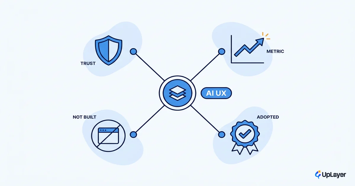
Most teams meet AI UX the same way: a feature gets greenlit because the board wants AI, it demos well in a Friday review, it ships, and then nobody opens it. The work felt like product design. The result moved no number you actually track.
AI UX is the discipline that decides whether that happens. It's the design work around a supportive AI capability (a copilot, an assistant, search, a summary) that makes users trust it, understand it, and keep using it. Done well, AI UX is a metric decision before it is a screen. Done as theater, it's a chat box bolted onto a roadmap nobody asked for.
We build these layers for a living, and we say no to most of them on purpose. Here's what the term actually means, where it differs from normal product design, and how to tell the version that pays off from the version that just demos.
What is AI UX
AI UX is the practice of designing the experience around an AI capability so that real users adopt it and it improves a metric the business already watches. The model is the engine. AI UX is everything the user touches: how they invoke it, how they read its output, how they recover when it's wrong, and how they learn to trust it over time.
The reason it's a separate discipline, and not just "UX with a new toy," is that AI changed the basic contract of the interface. Nielsen Norman Group frames current AI as the third user-interface paradigm in computing, after batch processing and command-based interaction. The user no longer tells the computer the steps. They state an outcome and the system figures out the how. That single shift moves a lot of control from the interface to the model, and your design job is to make that trade legible and safe.
So AI UX is not a visual style, and it is not the chat window. It's the set of decisions that determine whether a supportive AI layer earns a place in the product or gets uninstalled in a week. That decision discipline is the spine of good AI UX design, and it is what the rest of this piece unpacks.
How is AI UX different from normal UX
Normal UX is deterministic. You design a button, it does the same thing every time, and you can map every state in advance. AI UX is probabilistic. The same input can produce different output, the system is confidently wrong sometimes, and you cannot enumerate every state because the model generates them. That is why NN/g still describes generative interfaces as having deep-rooted usability problems years into the boom: the old playbook does not transfer cleanly.
The practical differences:
| Dimension | Normal UX | AI UX |
|---|---|---|
| Output | Deterministic, designed per state | Probabilistic, generated at runtime |
| Failure | Edge cases you can enumerate | Wrong answers you must assume will happen |
| Trust | Implicit once it works | Earned, calibrated, and easily lost |
| Your main job | Make the path obvious | Make uncertainty and correction obvious |
| Success metric | Task completion | Adoption plus a moved business metric |
This is why so much of the craft is about designing for AI uncertainty rather than polishing happy paths. If your team treats an AI feature like a normal feature, you get a screen that looks finished and breaks trust the first time it hallucinates.
The patterns that matter (and the ones that don't)
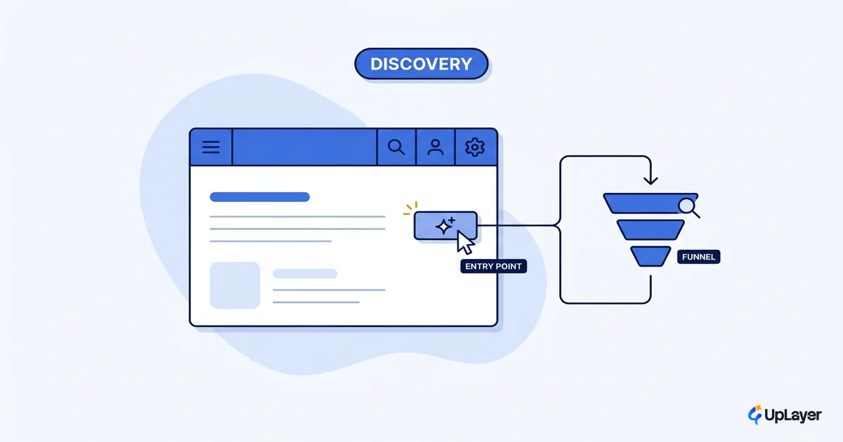
There is no shortage of "AI UX patterns" content. Most of it catalogs interface shapes without saying which ones earn their place. We start from the opposite end: the pattern only matters if it makes a supportive capability adopted and accountable to a metric. This is the through-line of our AI UX design approach, and it's where the underlying AI UX patterns that drive feature adoption come from.
The supportive patterns worth designing well are narrow and boring on purpose:
- Copilot that drafts inside an existing workflow, never blocking it.
- In-product assistant scoped to one job, not an open-ended bot.
- Semantic search that finds intent, not just strings.
- Summarization and triage that compress work the user already does.
For grounding the actual design choices, the IBM Research team published six research-backed design principles for generative AI applications at CHI 2024, covering how to set expectations, handle generation, and design for imperfection. They're a good baseline. The harder question is which feature deserves the effort at all. A simple test we run:
AI UX earns its place IF:

  moves_a_tracked_metric   (activation | retention | conversion | expansion)
  AND reliable_enough      (wrong answers are cheap to catch and fix)
  AND trust_is_legible     (the user can see confidence and correct it)
  AND no_simpler_path      (a rule, a filter, or a form would not do the job)

Otherwise -> do not build it. Ship the metric, not the AI.
If a proposed feature fails any line, the right design decision is to not design it. That is the part most teams skip.
Designing for the human in the loop
The center of good AI UX is the handoff between the model and the person. Get it wrong and a confident, wrong answer costs you trust you cannot easily win back. This is the heart of human AI interaction design: the model proposes, the human stays in control, and the interface makes both roles obvious.
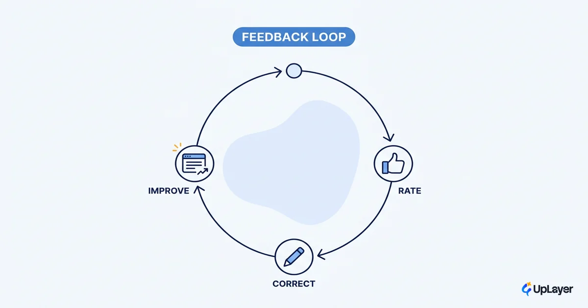
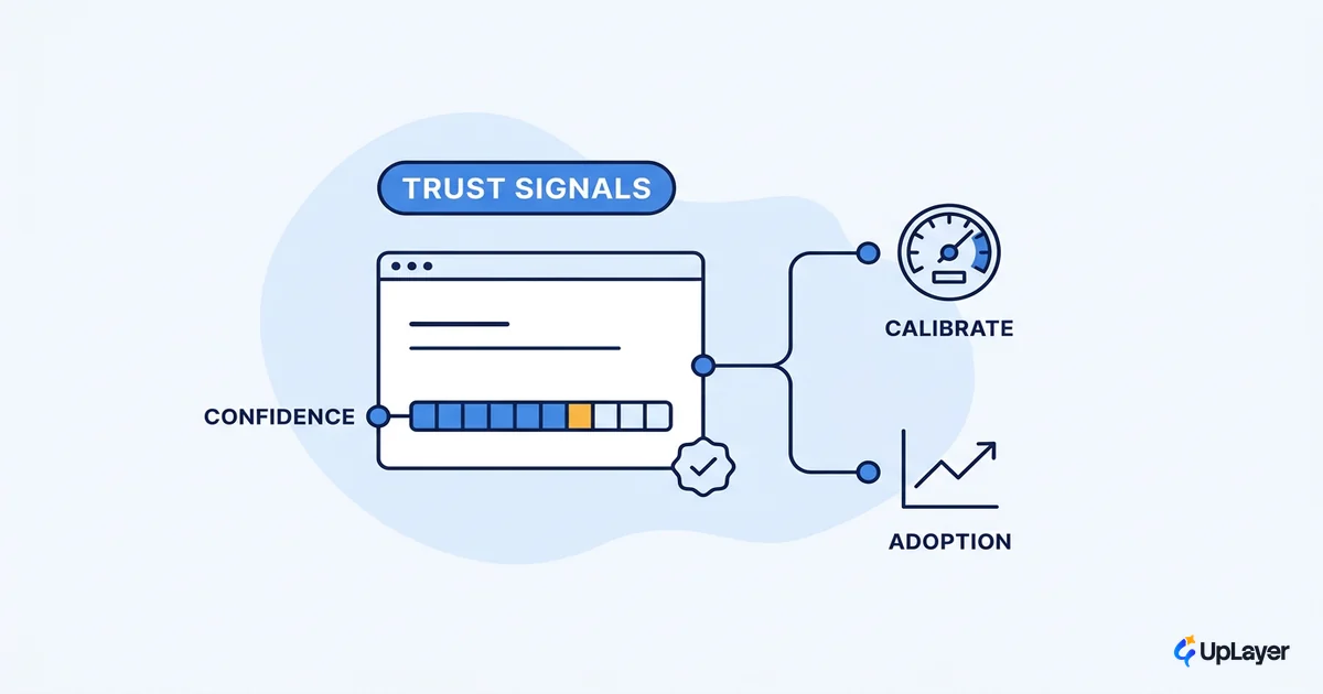
Google's People + AI Research team puts it directly: you have to calibrate user trust to what the system can actually do. That means showing confidence honestly, making output easy to inspect, making correction a one-click action, and keeping a human in the loop on anything high-trust. Reliability guardrails are not a backend concern here. They are UX, because they decide whether the user ever trusts the feature again.
WARNING
A confident, wrong AI answer does more damage than a missing feature. If your design cannot show its uncertainty and let the user correct it fast, you are shipping a trust liability, not a copilot.
Why most AI UX moves no metric
Here is the uncomfortable part. Most product features go unused, and AI features are not exempt. Pendo's analysis of usage across its customer base found that 80% of features are rarely or never used.
80% of features are rarely or never used, while roughly 12% of features generate 80% of daily usage. (Pendo, 2019 Feature Adoption Report)
An AI feature with no clear job lands in that 80%. The fix is not better prompting or a slicker chat UI. It's the supportive AI thesis: build a layer on top of the product that moves a number the team already tracks, and skip the ones that won't. We prove that projection before the build with a Concept Demo, a working prototype framed as "designed to move" the chosen metric, not a claim that it already did. When AI UX starts from the metric, the 80% problem stops being your problem.
How to tell good AI UX from theater
You don't need a rubric to feel the difference, but a checklist helps when the pressure to "do AI" is loud. Good AI UX design survives all four questions. Theater fails at least one.
| Question | Good AI UX | Theater |
|---|---|---|
| Does it move a tracked metric? | Tied to activation, retention, conversion, or expansion | "It's AI, it'll help engagement" |
| Is it reliable enough? | Wrong answers are caught and recovered in the UI | Hopes the model is right |
| Is trust legible? | Confidence, sources, and correction are visible | A black box that asks for faith |
| Could something simpler win? | No, the AI is the cheapest path to the outcome | A rule or filter would have done it |
If a feature passes all four, design it well and ship it. If it fails one, the most valuable design decision you can make is to not build it, and to spend the team on the feature that will.
The honest version of AI UX is less about novel interfaces and more about judgment: which supportive layer earns its place, how it stays trustworthy, and what number it moves. As products fill up with copilots and assistants over the next year, the teams that treat AI UX as a metric decision will quietly out-retain the ones that treated it as a demo. That is the version of AI UX worth building.
TIP
Not sure which AI feature in your product would actually move a metric? How the AX Audit works. We map the highest-ROI opportunity, prove it with a working concept demo, and tell you what not to build.