Human AI interaction design in real products
Human AI interaction design is the craft of the handoffs between user and model. Here is how to keep people in control and the system correctable.
 Shahriar P. ShuvoAI Product & UX Design7 min read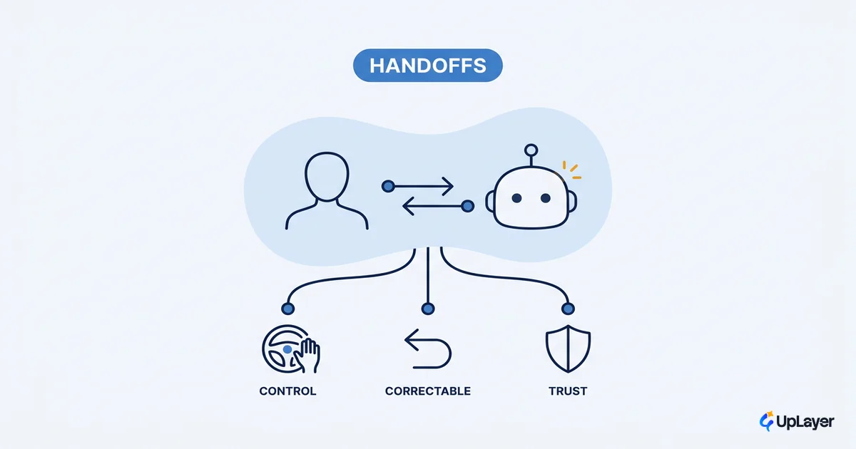
Most AI features do not fail because the model was wrong. They fail because the interaction gave the user no way to see that the model was wrong, and no cheap way to fix it. The model returned a confident answer, the screen presented it as fact, and the person either trusted it too far or stopped trusting the feature at all. That is a design problem, not a modeling problem. Human AI interaction design is the craft of the handoffs between a person and a model: who proposes, who decides, who corrects, and what happens when the answer is off. Get those handoffs right and a modest model feels reliable. Get them wrong and a strong model feels like a liability.
This piece is for the people deciding how an AI feature behaves in a real product, not how it is trained. We will define the term, map the four moments where the handoff happens, and walk the AI UX patterns that drive feature adoption by keeping users in control. The thread running through all of it: the interaction layer is where a supportive AI feature earns its adoption or quietly gets ignored.
What human ai interaction design actually means
Human AI interaction design is the discipline of designing the exchanges between a user and a model so the person stays in control and the system stays correctable. It sits inside the broader AI UX design discipline, but it has a narrower job: not the whole screen, just the moments where the model offers something and the user has to accept, edit, or reject it.
It is worth separating from model design. Model design decides what the system can predict. Interaction design decides what the user sees, how much they trust it, and how cheaply they can override it. Two teams can ship the same underlying model and get opposite outcomes, because one wrapped it in a confident, unundoable interface and the other made every output inspectable and reversible. The model is the engine. The interaction is the product.
The handoff is the product, not the model
The handoff is where adoption is won or lost, so it deserves the same rigor you give a pricing page. A good handoff does three things at once: it sets honest expectations about what the model can do, it makes the model's confidence visible, and it makes correction cheap. A bad handoff hides all three and hopes the model is always right.
Tie this to a number you already track. The interaction quality of an AI feature shows up as a measurable signal: correction rate, task completion, time-to-undo, or how often users accept a suggestion without editing it. If you cannot name the metric the handoff is supposed to move, you are decorating, not designing. This is the supportive-AI position: the AI sits above the core product as an assistant the user can always overrule, never as an opaque authority the user has to obey. It shows up most sharply in the way you design an AI copilot, where the model proposes inline and the person keeps the final say on every change.
NOTE
A "supportive" AI feature is one the user can see into and step over. If your interface makes the model's output hard to inspect or hard to undo, you have built an authority, not an assistant, no matter what the marketing says.
Four moments where the handoff happens
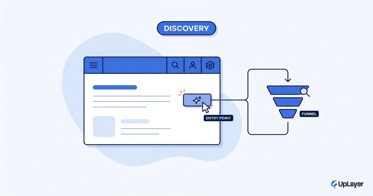
There are four moments in the relationship between a user and a model, and each needs a different design job. This maps cleanly onto Microsoft's 18 validated guidelines organized into four phases, drawn from more than twenty years of human-computer interaction research. We add one column the guidelines leave out: the metric each moment should move.
| Moment | The handoff | Design job | Metric to watch |
|---|---|---|---|
| First contact | Model introduces itself | Set honest expectations of what it can and cannot do | Activation, first-use drop-off |
| Steady use | Model proposes, user disposes | Show confidence; make accept/edit/reject fast | Suggestion accept rate, edit rate |
| When it is wrong | Model fails or low-confidence | Make the error visible and the fix cheap | Correction rate, time-to-undo |
| Over time | Model and user adapt | Learn from corrections; let users tune control | Retention, repeat use |
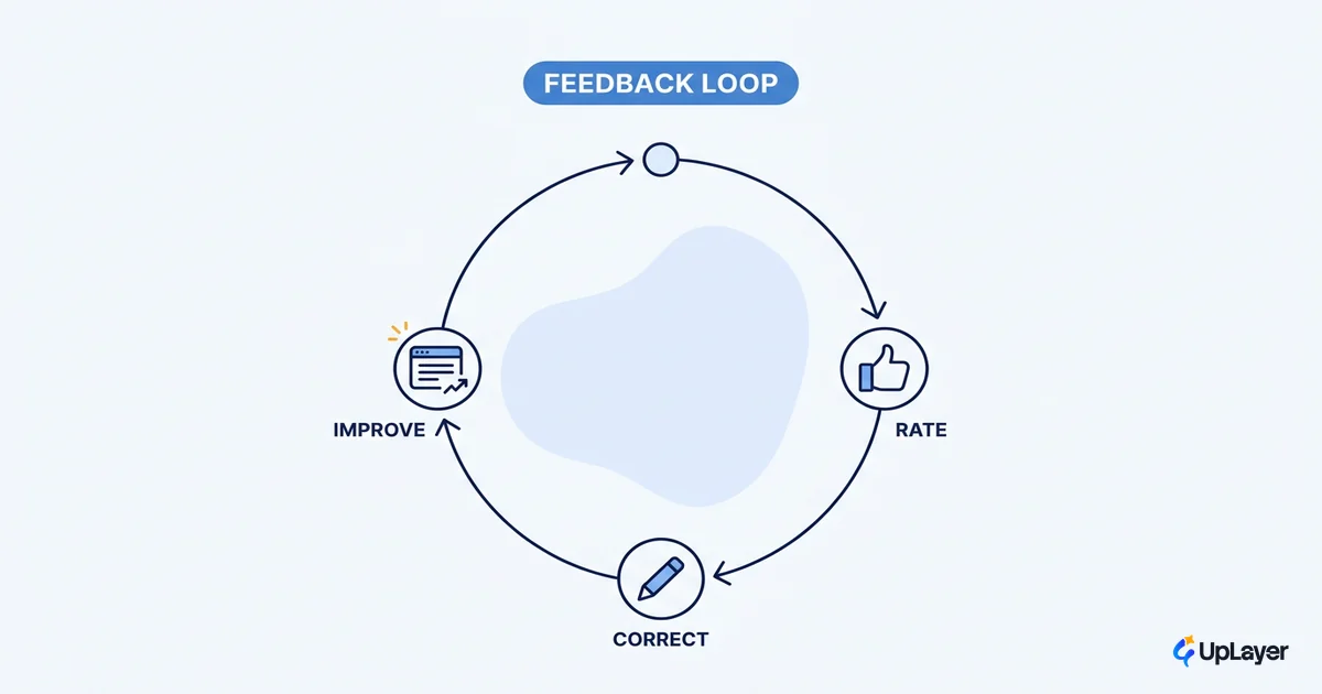
The pattern most teams skip is the third row. Steady-state demos look great because nobody clicks the wrong suggestion on stage. The product lives or dies in the "when it is wrong" column, and that is exactly where rushed AI features have no design at all. The fourth row is the one teams never build, because adapting over time depends on the feedback loops you design into the feature so the user's corrections actually reach the system instead of evaporating.
AI ux patterns that keep people in control
The AI UX patterns that matter are the ones that preserve user control at each moment, not the ones that look novel in a gallery. A short, durable set covers most cases.
- Set the expectation before the output. A one-line disclaimer about what the feature is good and bad at calibrates trust before the user reads a single result. When the handoff happens in a chat surface, designing the conversational AI exchange is where those expectations get set turn by turn.
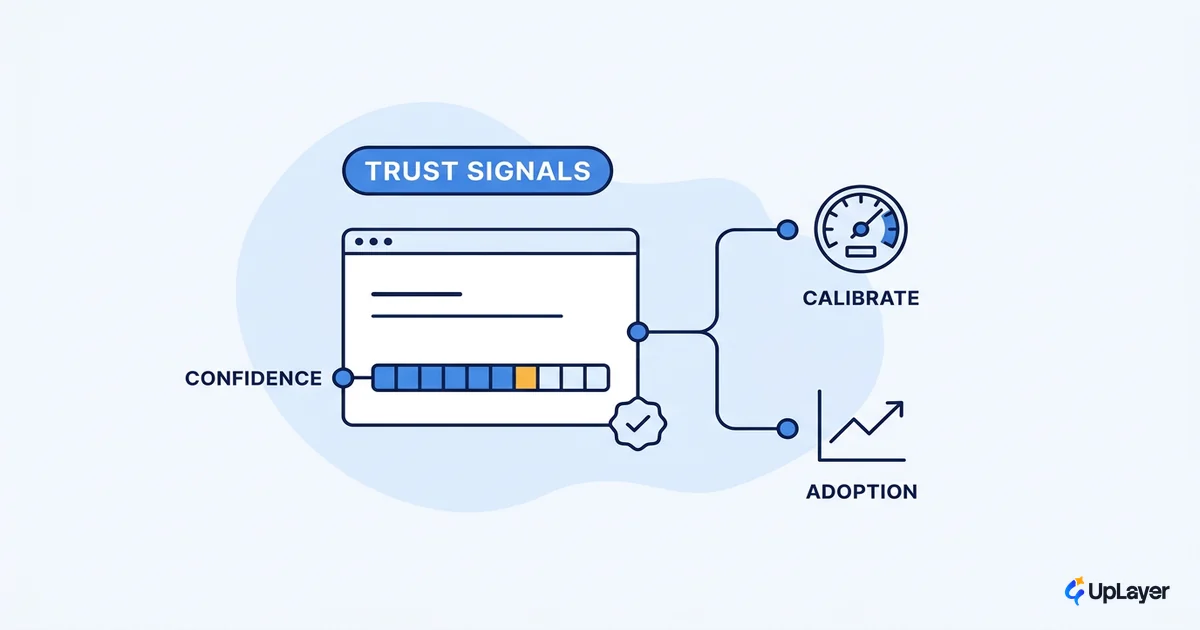
- Show confidence, do not bury it. Surface uncertainty as a signal the user can act on, whether that is a confidence label, a "draft" tag, or a visible source.
- Make correction the cheapest action on screen. Accept, edit, and reject should be one click each. If undoing the model costs more than accepting it, users will accept bad output.
- Provide a path forward when it fails. Google's PAIR team frames this well: when the system fails, the job is to provide a path forward from failure so the user can still finish the task, not hit a dead end.
You can compress most of these into a single rule the team can apply to any AI interface design decision.
HANDOFF RULE
For every model output the user sees, answer three questions:

1. CAN THEY SEE IT?      Is the model's confidence / source visible?
2. CAN THEY STEP OVER IT? Is reject or edit a one-click action?
3. CAN THEY RECOVER?      Is there a path forward when it is wrong?

If any answer is "no", do not ship the handoff. Fix the interaction,
not the model.
Designing for ai uncertainty without hiding it
Designing for AI uncertainty starts from one premise: the model will be wrong sometimes, and that is a design input, not a defect to paper over. The worst AI design principles are the ones that present every output with the same flat confidence, because they teach users to either over-trust or abandon the feature. Treat uncertainty as something the interface communicates honestly, the same way designing for AI uncertainty is handled as its own craft.
In practice that means giving the user real control over how much the model does on their behalf. The PAIR guidance is to balance control and automation, letting people control the parts of the experience they care about and opt out of the rest. High-stakes actions get a human checkpoint. Low-stakes, easily reversible actions can run automatically. The level of automation should track the cost of being wrong.
WARNING
Three handoffs to never ship: an AI output with no visible confidence, an automated action with no undo, and a failure state that dead-ends the user. Each one trades the user's control for the appearance of magic, and each one shows up later as a churned account.
How do you keep a human in the loop in ai ux?
You keep a human in the loop by designing the loop on purpose, not by bolting a "report" button onto an otherwise automated flow. Stanford HAI puts it sharply: think of automation not as removing the person but as the selective inclusion of human participation, which turns an automation problem into an interaction design problem.
A working loop has four beats: the model proposes, the user reviews, the user corrects, and the system learns from the correction. The correction step is the one that earns trust, because it proves to the user that the model is theirs to steer.
When automation is framed as the selective inclusion of human participation, the design question shifts from "how do we build a smarter system" to "how do we incorporate useful, meaningful human interaction into the system." That reframing is the whole job.
Keep the loop tight and visible and users will lend the feature more trust over time, because every correction they make is proof the system stays in their hands.
The teams that win the next few years of product work will not be the ones with the largest models. They will be the ones whose human AI interaction design keeps people in control and the system correctable, measured against a number they already track. Start with one feature, name the metric, and design the handoff before you tune the model.
TIP
Want to know whether your AI feature's handoffs are earning their keep, with the projected impact mapped to a metric you already track? How the AX Audit works.