Making AI features discoverable in your product
Most AI features fail on discovery, not capability. A practical guide to AI feature discoverability: the placement and affordance patterns that fix it.
 Sohanur RahmanAI Product & UX Design7 min read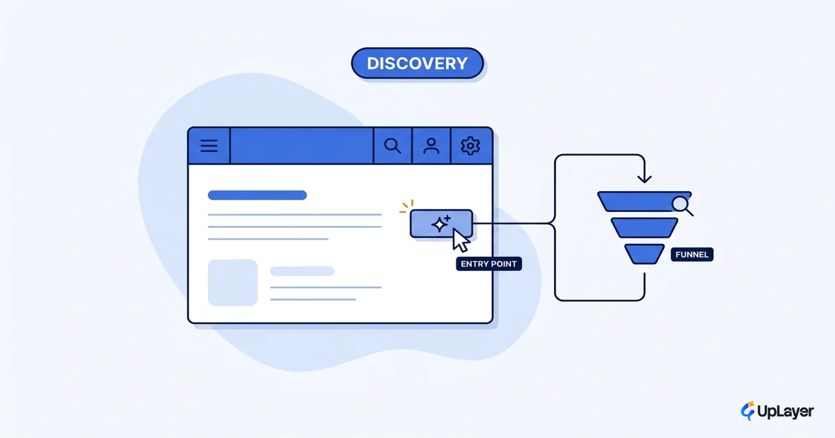
Your AI feature is probably not failing because the model is weak. It is failing because nobody can find it. That is the uncomfortable thing most teams skip past, because rebuilding a model feels like progress and admitting users never saw the feature does not. But ai feature discoverability, not capability, is where most shipped AI quietly dies. Pendo's usage study across its customer base found that 80% of features are rarely or never used, and AI features are not exempt. They are usually worse, because users have no mental model for where AI lives in your product or what it can do.
The pattern repeats across mature products. A team ships a capable assistant, watches the usage graph stay flat, and concludes the AI is not good enough. The real problem is almost always upstream of the model: the entry point is invisible, sits in the wrong place, or looks like nothing worth clicking. This guide covers why that happens and the AI UX patterns that drive feature adoption once people can actually find the thing.
Why do users never find your AI feature
Users never find your AI feature because they are not looking for it. They came to do a job, they have a mental model of where the controls for that job live, and your AI does not appear in that map. Capability does not matter if the affordance is missing.
Nielsen Norman Group ran a usability study on Amazon's Rufus assistant and watched this fail in real time. Amazon surfaced AI prompt suggestions inside the search bar, but none of their study participants clicked one, not even people who used Amazon daily, because there was no visual signal that the search bar did anything new. A second entry point, the product Q&A, was buried near the bottom of dense product pages where people scrolled straight past it on their way to reviews. The feature worked. The placement did not.
This is the trap: a flat usage number reads like a capability problem, so teams spend the next quarter improving the model. They are optimizing the wrong half of the funnel. A more capable assistant that nobody sees returns exactly what the old one did, which is nothing. The diagnosis you want is mechanical, not vague: did the user see the entry point, did they engage with it, did they complete the task. Discoverability is the first gate, and most AI features lose users there before the model ever runs.
AI feature adoption starts at discovery, not at the model
AI feature adoption is a funnel, and discovery is the front of it. Nobody adopts what they cannot find, so a discoverability gap caps adoption no matter how good the underlying feature is. Treat the two as one problem.
The economics make this expensive to ignore. In a subscription product, a feature that goes unseen does not just sit idle. It quietly lowers perceived value, because the customer is paying for capability they never experience, and that pressure shows up at renewal. Every unused feature is something a customer pays for and gets no value from. This is why discovery deserves the same scrutiny you would give a churn metric rather than being filed under design polish.
Pendo's research found that an average of 12% of features generate 80% of daily usage. The other 88% are not all bad features. Many are invisible ones.
The fix starts by picking the single metric the AI feature was meant to move, the same way you would increase AI adoption for any feature: a support deflection rate, a time-to-first-draft, an activation step. Then instrument the discovery funnel underneath it. If "engaged with the AI entry point" is near zero while task completion among the few who engage is healthy, you do not have a model problem. You have a discoverability problem, and it is cheaper to fix.
How do you make an AI feature discoverable
You make an AI feature discoverable by putting the entry point where the user already is when they need it, giving it a signifier that reads as actionable, and revealing it in context instead of all at once. Placement and affordance do most of the work.
Four patterns carry the load. The table maps each one to the failure it fixes and the metric it should move, so discoverability stays tied to a number rather than taste.
| Pattern | What it fixes | Metric it moves |
|---|---|---|
| Entry point at the point of need | AI buried in a menu or page bottom users never reach | Entry-point engagement rate |
| Signifier that reads as actionable | A control that looks identical to the old UI, so nobody clicks | Click-through on first exposure |
| Contextual reveal, not a full tour | Cognitive overload from showing every capability at once | First-session activation |
| Self-describing prompts | Users not knowing what the AI can do or how to ask | Task completion among new users |
The contextual-reveal pattern has the strongest research behind it. Nielsen Norman Group's onboarding work recommends you introduce features as users reach the moment they need them rather than dumping the full capability list in a first-run tour, and that you use broad, plain examples so people grasp what the tool does at a glance. A "Summarize this thread" button that appears at the top of a long thread teaches itself. A generic "AI Assistant" icon parked in the global nav teaches nothing.
AI UX patterns that turn ai feature discoverability into a number
The AI UX patterns that work share one trait: they reduce the distance between the user's intent and the AI's entry point to zero. The further the AI sits from the moment of need, the more discoverability you lose. The goal of these patterns is to make discovery measurable rather than aesthetic.
Instrument it as a funnel so the patterns are accountable to data, not opinion. A minimal discovery model looks like this:
discovery_rate   = users_who_saw_entry_point / eligible_users
engagement_rate  = users_who_clicked / users_who_saw_entry_point
activation_rate  = users_who_completed_task / users_who_clicked

# A flat feature with high discovery + high engagement + low activation
# is a CAPABILITY problem (fix the model).
# A flat feature with low discovery OR low engagement
# is a DISCOVERABILITY problem (fix placement and affordance).
That split is the whole point. It tells you, with numbers, whether to touch the model or the UI. Most teams that "rebuild the AI" never ran it, which is why they rebuild the wrong half.
Practical patterns that raise the top two rates: place the entry point in-context at the moment the job appears, keep a persistent but quiet anchor for return users, write self-describing labels ("Draft a reply" beats "AI"), and use progressive disclosure so the first interaction is small and the depth reveals as trust grows.
WARNING
Discoverable is not the same as unavoidable. Interstitials, pre-checked AI toggles, and modals that block the real task inflate engagement numbers while eroding trust. If users click only because you cornered them, your discovery funnel looks healthy and your retention does not. Surface the feature where it helps, then get out of the way.
AI onboarding design and AI UX best practices that drive discovery
Good AI onboarding design teaches the feature in the flow of real work, not in a separate tutorial nobody finishes. The best practice is contextual and incremental: surface a capability the first time the user hits the need it solves, explain it in one line, and let them try it on their own data.
This is where AI UX best practices diverge from generic onboarding. AI features carry a mental-model gap that ordinary buttons do not, so the guidance has to do double duty: show where the feature lives and set honest expectations for what it does. Nielsen Norman Group frames AI well when it describes it as a supportive assistant surfaced at the moment of need, augmenting the existing workflow rather than replacing it. Tooltips beat tours. One contextual hint at the right moment outperforms a six-step walkthrough every time. Pair that with AI onboarding design that introduces one capability at a time, and discovery stops being a launch-week spike that decays.
There is an honest limit worth stating, because it is the half of the discussion the adoption-tool blogs leave out. If you fix placement and affordance, engagement climbs, and the feature still moves nothing, the problem was never discoverability. It was the feature. At that point the right move is to cut it, not to add another tooltip. The way you know which it is, is to measure the ROI of the feature against the one metric it was supposed to move. Discoverability work earns its place only when a discovered feature actually pays off.
Strong ai feature discoverability is the cheapest growth lever most AI products are ignoring, because it sits in placement and affordance rather than in the model everyone is tempted to rebuild. Instrument the discovery funnel before you touch anything, fix the entry point, and let the numbers tell you whether you have a discovery problem or a feature that should not exist.
TIP
Want to know whether your AI feature is failing on discovery or on the metric itself? How the AX Audit works.