AI UX best practices for product teams
AI UX best practices that earn their place: a working checklist where each practice is tied to the adoption or trust signal it protects, not decoration.
 Anamoul RoufAI Product & UX Design7 min read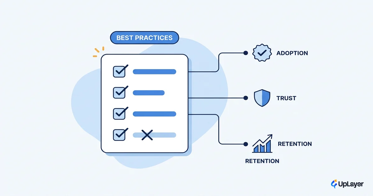
Most AI features don't fail because the model is weak. They fail at the interface, where a user can't tell what the feature does, can't trust the answer it gives, and can't recover when it's wrong. The model can be excellent and the feature still gets tried once and abandoned. So the useful version of AI UX best practices is not a style guide. It's a list of the specific ways an AI feature loses users, paired with the one practice that closes each gap.
We build AI as a supportive layer on top of a product that already works, so we treat the interface as the thing covering for a system that will sometimes be wrong. That framing changes the rules. A practice is worth following only when it protects a signal you already track: discovery, activation, trust, or retention. If a practice doesn't move one of those, it's decoration, and we skip it. This post is the checklist we actually apply, and the metric behind each line.
What are the core AI UX best practices
The core AI UX best practices are: set expectations before the AI acts, show the reasoning behind its output, make every AI action reversible, design the error state first, and keep a human in the loop where being wrong is expensive. Each one exists to protect a measurable signal, not to satisfy a rubric.
The reason these five matter more than a longer list is that AI breaks the old contract of a deterministic interface. When the interface generates itself around an outcome rather than a fixed set of buttons, users lose the affordances they normally read to understand a product. Nielsen Norman Group calls this outcome-oriented design: the system produces a result, but the user can no longer see the menu of what's possible. Discoverability gets harder, not easier, so the product has to teach capability in context. These five practices are how a feature compensates.
| Practice | The signal it protects | Skip it when |
|---|---|---|
| Set expectations before the AI acts | Discovery, activation | The action is a single obvious button with no ambiguity |
| Show the reasoning | Trust | The output is low-stakes and instantly verifiable by the user |
| Make actions reversible | Trust, retention | The action is already non-destructive and trivially repeatable |
| Design the error state first | Activation, retention | Never. A wrong or empty result is the default, not the edge case |
| Keep a human in the loop | Trust | The cost of a wrong answer is near zero |
This is the catalog in compressed form. For the patterns each practice maps to and how they drive usage, see our deeper write-up on AI UX patterns that drive feature adoption.
Set expectations before the AI acts
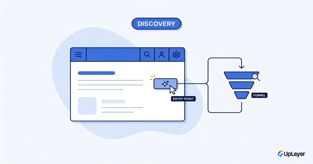
Tell the user what the feature can do, what it will do next, and roughly how confident it is, before it acts. The most common adoption failure is not a bad answer. It's a user who never understood what the feature was for and so never tried it.
This matters because AI moved the interaction model. Nielsen Norman Group describes the shift as intent-based outcome specification: the user tells the computer the outcome they want, not the steps to get there. That sounds freeing, but it removes the command vocabulary people used to lean on. A blank prompt box is not a feature, it's a quiz with no study guide. Setting expectations replaces the missing affordances with a scoped suggestion, an example, or a one-line statement of what happens when the user commits.
The signal this protects is activation. A feature that explains itself in context gets a first use; one that demands the user already know what to type gets ignored. Scoping the promise also caps disappointment, because the user judges the output against what you said it would do, not against an imagined perfect assistant.
Show the reasoning, or the output reads as a guess
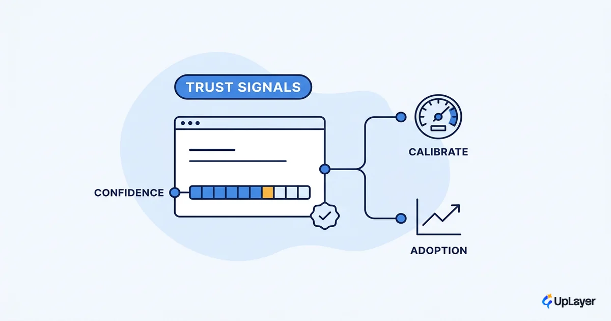
Show why the AI produced what it did: the source it used, the inputs it weighed, or a short rationale. Without that, a correct answer and a confident hallucination look identical, and the user has no way to tell which one they're holding.
The mechanism is verifiability. When the interface exposes a citation, a highlighted source passage, or a plain-language reason, the user can spot-check the claim in seconds instead of either trusting blindly or distrusting everything. That second failure mode is the quiet killer: a user who can't verify output stops relying on the feature for anything that matters, which is exactly the work you wanted it to do. Good AI design principles treat reasoning as part of the output, not an optional panel.
This protects trust, and trust is what converts a novelty into a habit. The depth of explanation should be proportional to the stakes: a draft reply needs almost none, a recommendation that changes a customer's data needs a visible rationale. We go further on calibrating that in designing for AI uncertainty, because over-explaining a trivial action is its own kind of friction.
Make AI actions reversible and design the error state first
Assume the AI will be wrong, and design that moment first. The undo, the empty result, and the failed call are not edge cases in an AI feature. They are the load-bearing surfaces, because a probabilistic system produces them constantly.
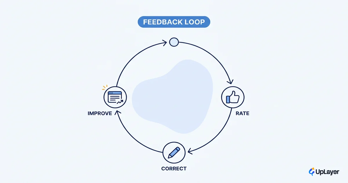
Microsoft's 18 guidelines for human-AI interaction organize good behavior around four moments: initial interaction, regular use, when the system is inevitably wrong, and over time. The "when wrong" category is the one most teams under-build, because the happy path demos well and the failure path doesn't show up until real users arrive. Reversibility is the cheapest insurance you can buy against that. If every AI action can be undone in one step, a wrong answer costs the user a click instead of their confidence.
Design the error and empty states as deliberately as the success state:
For each AI action, define before you ship:
  1. EMPTY    -> no result yet. What does the user see and do next?
  2. LOW-CONF -> a weak or uncertain result. How is it flagged?
  3. WRONG    -> a confident but incorrect result. How is it corrected?
  4. FAILED   -> the call errored or timed out. What is the fallback?
  5. UNDO     -> every applied action reverts in one step.
If any row is blank, the feature is not ready to ship.
WARNING
The most common reason an AI feature feels broken is not a bad model. It's an unhandled empty or error state that leaves the user staring at a spinner or a blank panel. The fix often lives in the loading and feedback states you design for an AI feature, which keep the user oriented while the model works instead of leaving dead air. Build the recovery before the magic.
This protects activation and retention together. A feature that recovers gracefully survives the model's misses; one that strands the user on the first wrong answer gets uninstalled in the head, if not in the settings. Our companion piece on designing AI empty and error states that recover covers the patterns in detail.
Keep a human in the loop where trust is expensive
Put a human checkpoint between the AI and any action whose cost, if wrong, is high: anything that touches money, customer-facing communication, or irreversible data. Everywhere else, let the feature run. Oversight is a dial, not a switch, and the setting should match the stakes.
The reason this is a best practice and not just caution is that AI is now table stakes. The Stanford HAI 2025 AI Index reports that adoption is near-universal:
78% of organizations reported using AI in 2024, up from 55% the year before.
When almost everyone ships AI, shipping it stops being the advantage. The advantage is whether users trust your version enough to keep it in their workflow. Sound human AI interaction design earns that trust by being honest about where the model is allowed to act alone and where a person confirms first. Over-gating a low-stakes feature adds friction nobody asked for. Under-gating a high-stakes one produces the single bad outcome that ends adoption for good. Match the oversight to the cost of being wrong, and measure whether the checkpoint is being used or just clicked through.
How do you keep AI UX from feeling unreliable
You keep AI UX from feeling unreliable by making reliability visible, not by chasing a perfect model. Show what the feature does before it acts, expose the reasoning so output can be checked, make every action reversible, and design the failure states as carefully as the success state. Reliability is a perception built at the interface, and these practices are how you build it.
The trap is treating model quality as the whole problem. You can ship a strong model behind an interface that hides its reasoning, swallows its errors, and offers no undo, and users will call the feature unreliable, because from where they sit it is. The fix is rarely a better model. It's the UX layer doing its job of covering for a system that will sometimes be wrong, so a miss reads as a recoverable moment instead of a betrayal.
Putting the checklist to work
The point of AI UX best practices is not to apply all of them everywhere. It's to know which signal each one protects, then spend your design effort where a real adoption or trust risk lives and skip the rest. Tie every practice to a metric you already track, build the recovery path before the demo, and you ship a feature people keep using instead of one they try once.
TIP
Want these practices applied to the single highest-ROI AI feature in your product, designed to move a metric you already track? How the AX Audit works. We design what earns its place and tell you what to skip.