Designing AI empty and error states that recover
A practical guide to AI error states design, with patterns for empty, error, and no-answer states that hold user trust when the model fails or stalls.
 Shahriar P. ShuvoAI Product & UX Design7 min read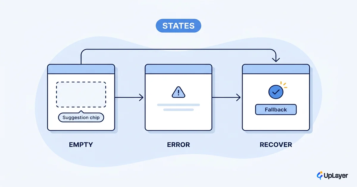
Every AI feature is demoed on its best day and met by users on its worst. The demo shows a clean prompt, a fast response, and a perfect answer. The real product shows a blank box on first run, a timeout at 2pm on a Tuesday, and a confident reply that happens to be wrong. Good AI error states design is the work of making those bad days survivable, and it is the part almost nobody mocks up. Most teams polish the happy path and leave the empty, error, and no-answer states as an afterthought, which is exactly backwards: those states are where trust is won or lost. This guide is the per-state playbook, and it pairs with our work on designing for AI uncertainty without losing trust, where the broader trust argument lives.
The premise is simple. An AI feature has three failure-shaped states it must design on purpose, not by accident. Get them right and the feature earns a second try. Get them wrong and users quietly stop opening it.
Why AI error states design is different from normal error handling
Conventional software fails in predictable ways. A form rejects a bad email. A server returns a 500. You can enumerate the error cases and write a message for each. AI features break in fuzzier ways: the same input can produce different output twice, the model can be confidently wrong, latency swings from instant to ten seconds, and sometimes the system runs perfectly and still has nothing useful to say.
That last case is the one teams miss. Google's People + AI team draws a useful line between context errors and failstates: a context error is when the system works as intended but breaks the user's mental model, while a failstate is when the system cannot provide the right answer, or any answer at all, because of its own limitations. A 404-style "something went wrong" page covers neither well. PAIR's guidance is that messages about these errors should inform the user as specifically as possible about the system's limitations, not hide behind a generic apology.
So before you design a single screen, name the three states.
The three states every AI feature has to design
Designing for AI uncertainty starts with admitting how many ways an AI feature can leave the user staring at something other than an answer. There are three, and each one triggers a different fear in the user.
| State | What triggers it | What the user fears | What to show |
|---|---|---|---|
| Empty | First run, no data yet, nothing typed | "I don't know what this can do" | Scope, sample prompts, one example output |
| Error | Model failed, timed out, or was rate-limited | "It's broken and I lost my work" | Plain-language cause, retry, manual fallback |
| No-answer | Model ran fine but has nothing useful | "It's making things up" | An honest "I can't answer this," and the next move |
These map directly onto the AI UX patterns that drive feature adoption: adoption is not just the moment a feature works, it is the moment a feature fails well enough that the user comes back. The rest of this guide takes each state in turn.
Empty states: design the cold start, not a blank box
The empty state is the first thing a user sees, and a blank box is the worst possible answer to "what can this do?" In AI interface design the empty state has a second job beyond looking tidy: it has to teach the model's scope. Users cannot guess what a model accepts, so an empty state that just says "No results" wastes the one moment the user is actually paying attention.
Nielsen Norman Group's research on empty states is direct about this. Treat the empty state as an in-context learning cue that helps users understand how to use the feature in real time, which generally works better than a forced upfront tutorial. For an AI feature that means three things in the empty state:
- Scope. One sentence on what the feature can and cannot do.
- Sample prompts. Two or three real, clickable examples, not lorem ipsum.
- One example output. Show the shape of a good answer so expectations are calibrated before the first try.
Do that and the empty state stops being dead space and starts being onboarding.
Error states: say what failed, in human language, with a way out
An error state fires when the model genuinely fails: a timeout, a rate limit, a dropped connection, a malformed response. These failure paths are most frequent in generative features, where variance and latency are constant, so generative AI product design treats the failed call as a surface to plan for rather than an exception to patch later. The temptation is to ship the raw exception or a cheerful nothing-message. Both lose trust. Nielsen Norman Group's error-message guidelines still apply here, just harder: describe the issue precisely and offer a way out rather than stating a generic "An error occurred" that gives the user no context and no next step.
For AI specifically, two rules carry most of the weight. Never blame the user for the model's failure, and always leave a manual path so the user can finish the job without the AI. A simple decision rule keeps error copy honest:
AI error copy = WHAT_FAILED (plain language)
              + WHY_IT_MATTERS_TO_YOU (in user terms, not system terms)
              + ONE_CLEAR_ACTION (retry, edit, or do it manually)

Banned: raw stack traces, "Oops!", blaming the user,
        dead ends with no manual fallback.
This is where AI transparency patterns users can read earn their keep. A timeout that says "The model took too long. Your draft is saved. Retry, or write it yourself" keeps the user moving. A spinner that never resolves does not.
What should an AI feature show when it has no answer?
This is the hardest state and the one most teams skip entirely. The model ran fine. It just has nothing useful to say. In PAIR's taxonomy this is the failstate, and it is the single biggest place AI trust leaks away, because the easy move is to fake an answer rather than admit the gap.
WARNING
A confident wrong answer is more expensive than an honest "I don't know." The first time a user catches the model bluffing, they stop trusting every answer it gives, including the correct ones. Honest empty beats confident wrong, every time.
So the no-answer state has to do three things: say plainly that it cannot answer, give a readable reason when one exists, and offer the next move. "I couldn't find anything matching that. Try widening the date range, or search the docs directly" is supportive AI. A made-up answer is a liability you will pay for later. This is also a feedback opportunity, not just a dead end. Google's PAIR guidance notes that user feedback can improve the experience over time, so a "this wasn't helpful" control on a no-answer state turns a miss into corrective signal. Designing AI confidence and trust signals well, which we cover in designing AI confidence and trust signals, is what lets a user tell an honest gap from a system failure.
How do you design AI error states that keep trust?
The pattern that ties all three states together is graceful degradation. When the AI cannot deliver, the feature should fall back to something useful rather than collapse. PAIR puts it plainly: when the system is uncertain or cannot complete a request, fail gracefully to a default that doesn't rely on AI so the user can still get the job done right now. The search box still searches. The editor still edits. The AI layer sits on top and steps aside when it has to.
Microsoft's research-backed guidelines for human-AI interaction point the same direction. Among their eighteen rules, the ones for when the AI is wrong are to support efficient dismissal and efficient correction of the system's output. Make it one click to wave off a bad suggestion and one step to fix it. A feature users can correct is a feature users keep.
Put together, the recovery pattern for any AI state looks like this:
- Detect the state (empty, error, or no-answer) explicitly, not as an undefined fallthrough.
- Tell the user what is true, in their language.
- Offer a non-AI path to finish the task.
- Capture feedback so the failure trains the next version.
NOTE
These are the same ai ux best practices that apply to any well-designed feature. The difference with AI is that the failure paths are more frequent and more visible, so they deserve first-class design time instead of last-sprint polish.
Wire failure paths to the metric, not just the mockup
Here is the part that turns this from a design exercise into a business one. Every failure path defends the metric the feature was built to move. An empty state that teaches scope protects activation. An error state with a manual fallback protects retention. A no-answer state that stays honest protects the trust that the entire feature depends on. When you treat AI error states design as metric-defense rather than cosmetic cleanup, you stop arguing about polish and start measuring whether the feature still earns its place on a bad day. Design the worst day on purpose, and the good days take care of themselves.
TIP
Want to know which AI feature is worth designing this carefully, and prove it on a metric you already track? How the AX Audit works.