How to design AI features users actually adopt
How to design AI features users adopt: gate every step on a metric, design the uncertain states, make output verifiable, and place it where work happens.
 Anamoul RoufAI Product & UX Design8 min read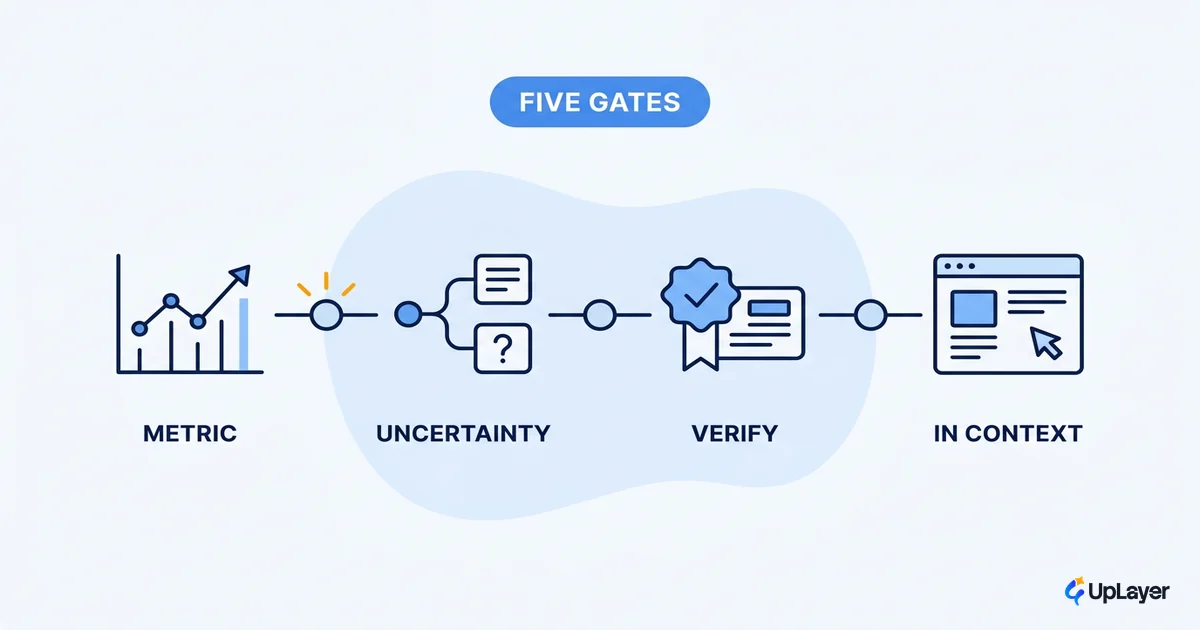
Knowing how to design AI features is less about the model and more about everything around it: where the feature shows up, what it says when it's unsure, and how a user recovers when it's wrong. Teams that get the model right and the surrounding design wrong ship features that demo well and get abandoned in a month.
AI features fail differently from normal ones. A normal feature works or it has a bug. An AI feature is probabilistic. It's right most of the time and wrong some of the time, and the design has to plan for the wrong cases on purpose. Most don't. They design the happy path, ship it, and meet the failure modes in production, where they cost trust instead of a code review comment. Gartner expects at least 30% of generative AI projects to be abandoned after proof of concept by the end of 2025, with unclear business value and weak risk controls near the top of the causes.
This guide treats the work as a sequence: anchor to a metric, design the uncertainty, make the output verifiable, place it in the existing workflow, and build a recovery path. The order matters, because skipping an early step makes the later ones cosmetic. The same honesty about confidence runs through designing for AI uncertainty without losing trust, which sits underneath every step here.
Start from the metric, before the model
The first move in how to design AI features is to name the metric the feature should move, before picking a model or a pattern. A feature with no target metric has no definition of done and no way to tell whether the design worked.
This is obvious and routinely skipped. Teams start from a capability ("we could summarize this") and reason forward to a feature, never asking which number the summary should move. The result works and changes nothing measurable. Reverse it. Pick a metric the product already tracks, such as activation, time-to-first-value, or support resolution time, then ask what feature could plausibly move it. The metric becomes the constraint: every later decision gets judged against whether it helps that number.
This is where ai feature design splits from generic UX work. The design isn't done when the feature is usable. It's done when the feature moves the metric, and that standard kills attractive ideas early, which is the point. The same discipline runs through the craft of AI feature design, where every choice is judged against the number it is meant to move. For the full method, how to measure the ROI of an AI feature covers attaching a feature to one number and measuring the delta.
Designing AI features means designing the uncertain states
Designing AI features means designing the uncertain and wrong outputs with the same care as the correct one, because the model will be uncertain and wrong often enough to define the experience. A design that only handles the confident, correct case is designing for a fraction of real usage. Deciding which uncertain states are even worth shipping is part of deciding an AI feature is worth building before any pixels get drawn.
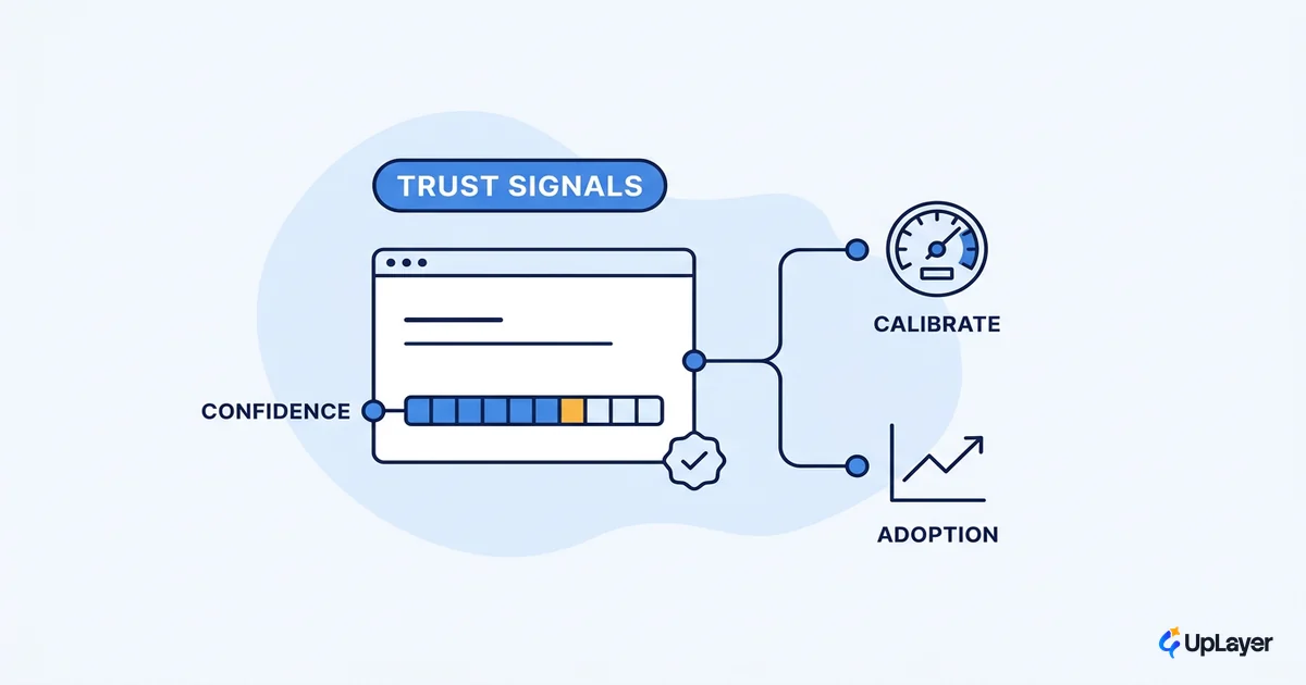
Every AI output sits somewhere on a confidence spectrum, and the design has to tell the user where, in language they can act on. "Here is the answer" and "here is a draft you should check" are different contracts. Show the wrong one and you break trust. The features users keep are honest about confidence: they surface uncertainty instead of hiding it, and they make the low-confidence case useful instead of blank.
There are three states to design, not one:
| State | What the user sees | Design goal |
|---|---|---|
| Confident output | A direct answer or action | Make it easy to accept or apply |
| Uncertain output | A draft, options, or a flagged answer | Invite review without blocking the user |
| No good output | A graceful empty state, not a wrong guess | Fail safely; never fabricate to fill the space |
The third state is the one teams forget. When the model has no good answer, a feature that invents one is worse than a feature that says so.
WARNING
A fabricated answer that looks confident is the fastest way to lose a user. The next correct answer now carries doubt. Anti-hallucination guardrails are a design requirement, not a backend afterthought.
For the empty and no-answer cases specifically, designing AI empty and error states that recover covers the patterns that turn a failure into a retry instead of an exit.
Make every output verifiable
One of the load-bearing ai ux best practices is to make every AI output verifiable: show the source, the input, or the reasoning so the user can check the answer without leaving the feature. Users adopt features they can trust, and trust comes from the ability to verify, not from being told to.
The skepticism is real and worth designing for. In the 2025 developer survey, more developers distrust the accuracy of AI output (46%) than trust it (33%), and only 3% report highly trusting it. These are the people closest to AI tooling all day. Verification is what lets a cautious user act anyway.
It looks different by feature type. A semantic search result should link to the document it came from. A summary should expand to the source passage. A suggested action should show what it's about to change before it commits. The common thread: the user can confirm the output is right in one glance, inside the feature. The moment verification means leaving the feature to check elsewhere, most users stop checking and either over-trust or quit.
This is also the cheapest insurance against the cost of being wrong. When the user can see the source, a wrong answer is a visible mismatch they catch immediately, not a silent error that surfaces later. For consequential actions, pair verification with human-in-the-loop confirmation: the AI proposes, the human approves, and the system records both. That keeps a feature usable even when accuracy is imperfect, which it always is.
Place the feature where the work already happens
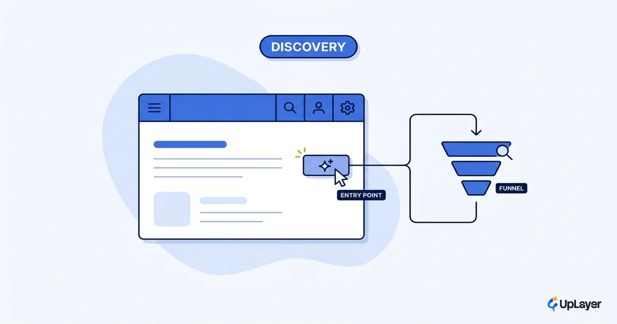
AI features get adopted when they appear inside an existing workflow, not behind a new tab the user has to remember to open. Placement decides adoption more than model quality does.
The clearest evidence is in developer tools. Inline code completion won because the suggestion appears in the editor, at the exact spot the developer is typing, with no context switch. In a controlled GitHub study, developers using inline Copilot completed the task 55% faster than those without it, and at a higher completion rate. That placement is a large part of why 51% of professional developers now use AI tools daily. A feature that lives where the work already happens gets used by default; one that asks the user to navigate somewhere new starts every session at zero. Placement is only half the job; the other half is making the AI feature discoverable at the moment it becomes useful, so users notice it without a tour.
So the design question isn't only "what should this feature do" but "where in the current interface does it surface." If the honest answer is "a new screen," the feature carries an adoption tax most teams never pay off. Find the existing surface it can attach to, even if that means a smaller feature. A small feature that gets used beats a large one that doesn't. The interaction shapes that survive this test are collected in AI UX patterns that drive feature adoption.
Where do most AI features fail in design
Most AI features fail in design at two points: they have no target metric, so success is undefined, and they have no uncertainty handling, so the wrong cases destroy trust faster than the right cases build it. Both failures happen before a single line of model code, which is why both are cheap to fix early and expensive to fix after launch.
The pattern is consistent. Teams over-invest in the model and under-invest in the surrounding design, then blame the resulting low adoption on the model and reach for a bigger one. The fix is almost never a bigger model. It's a clearer metric, honest confidence states, verifiable output, better placement, and a real recovery path. Those five are the design, and they're what drives ai feature adoption.
How to design AI features: the five-step sequence
What does it take to design an AI feature people use? Run these five gates in order, and let any unanswered gate stop the feature before it ships:
1. METRIC      Name the tracked number the feature must move.
               No metric -> no feature. Stop here.
2. UNCERTAINTY Design the confident, uncertain, and no-answer
               states as equals. Never fabricate to fill space.
3. VERIFIABLE  Let the user confirm any output in one glance,
               inside the feature, without leaving it.
4. PLACEMENT   Attach the feature to a surface the user already
               uses. A new screen is an adoption tax.
5. RECOVERY    Make a wrong output cheap to fix, and feed the
               fix back so the feature visibly improves.
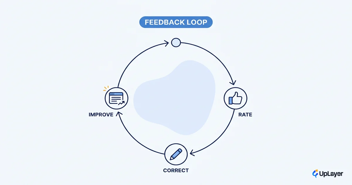
A feature that clears all five is designed to be adopted. One that skips the metric or the uncertainty states is designed to demo. Recovery is the quiet fifth gate: a wrong output should be easy to correct, dismiss, or redo without penalty, and the correction should improve the system so the user sees their input mattered. AI features will be wrong; the ones users keep make being wrong cheap to fix.
Before any of this, there's a prior decision about whether the feature earns a place at all. That's the job of how to decide which AI features to build, the prioritization layer this design process assumes you've already run.
The model is the easy part now. Knowing how to design AI features that get adopted is the work: the metric that defines success, the uncertainty the model will produce, the verification that earns trust, the placement that removes friction, and the recovery that survives mistakes. Get those right and a modest model ships a feature people keep. Get them wrong and the best model on the market ships a feature people try once.
TIP
Want a feature designed to this standard, on a metric you already track? How the AX Audit works. We map the highest-ROI opportunity, project the return on a number your team owns, and build a working concept demo. Under the 3X Guarantee, the audit finds AI worth at least three times the fee, or it's free.